Design systems in Figma
2020-2024 | ISLE OF MAN
Brief
To collaborate as a cross vertical Product team on Figma to create style guides and components for wider brand vertical.
My Role
UI/UX (Product) Designer
I was responsible for creating style guides and design systems for wider brand verticals. Designs hand-off to development team for implementation. I mentored and trained my team members.
Team:
7 cross-vertical UI and UX Designers from different teams.
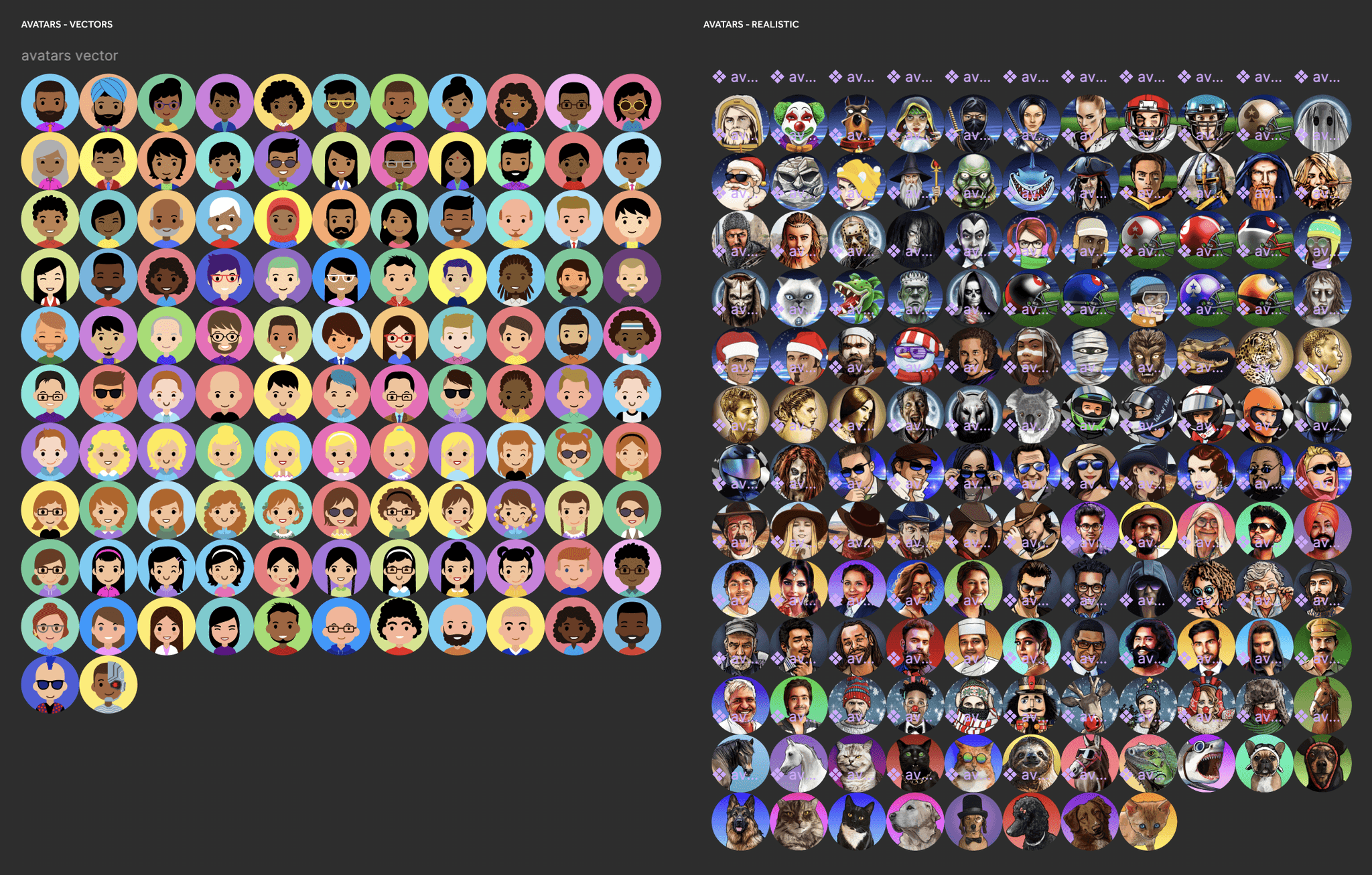
Design system implementation UX metrics
ACCESSIBLE: By incorporating WCAG Guidelines by creating accessible colours and buttons, my designs target wider userbase.
FLEXIBLE: My design system detects device's light or dark mode settings. This level of flexibility makes the app compliant in iOS and Play store.
IMPACTFUL: This effects experience of millions of users who are using our product.
Problems
Inconsistent Designs: Our different products were having different design languages. They needed to be consistent.
Accessibiity issues: All the Primary CTAs were not compliant to WCAG guidelines.
Different product and different styles: To create a style guide and design system that fits all the products in the wider brand. Involves Brand, Sports, Casino, Poker, Marketing and Sales.
Solutions
Created the style guides using components, instances and variables and imported the tokens to our Figma project files.
Established the brand colours and latest design system updates to our products.
Made the primary CTAs accessible.
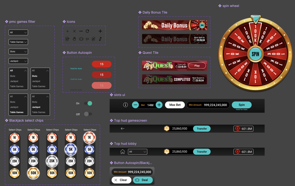
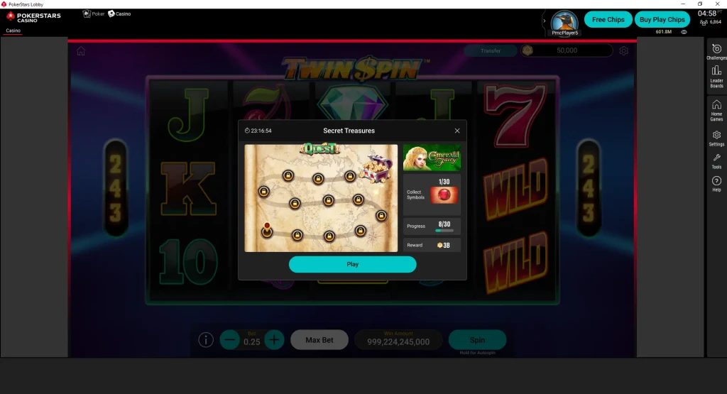
Product 1: PMC, mobile & web
PMC older toolkit
The old UI was golden and beveled buttons with lot of light effects on the HUD elements.
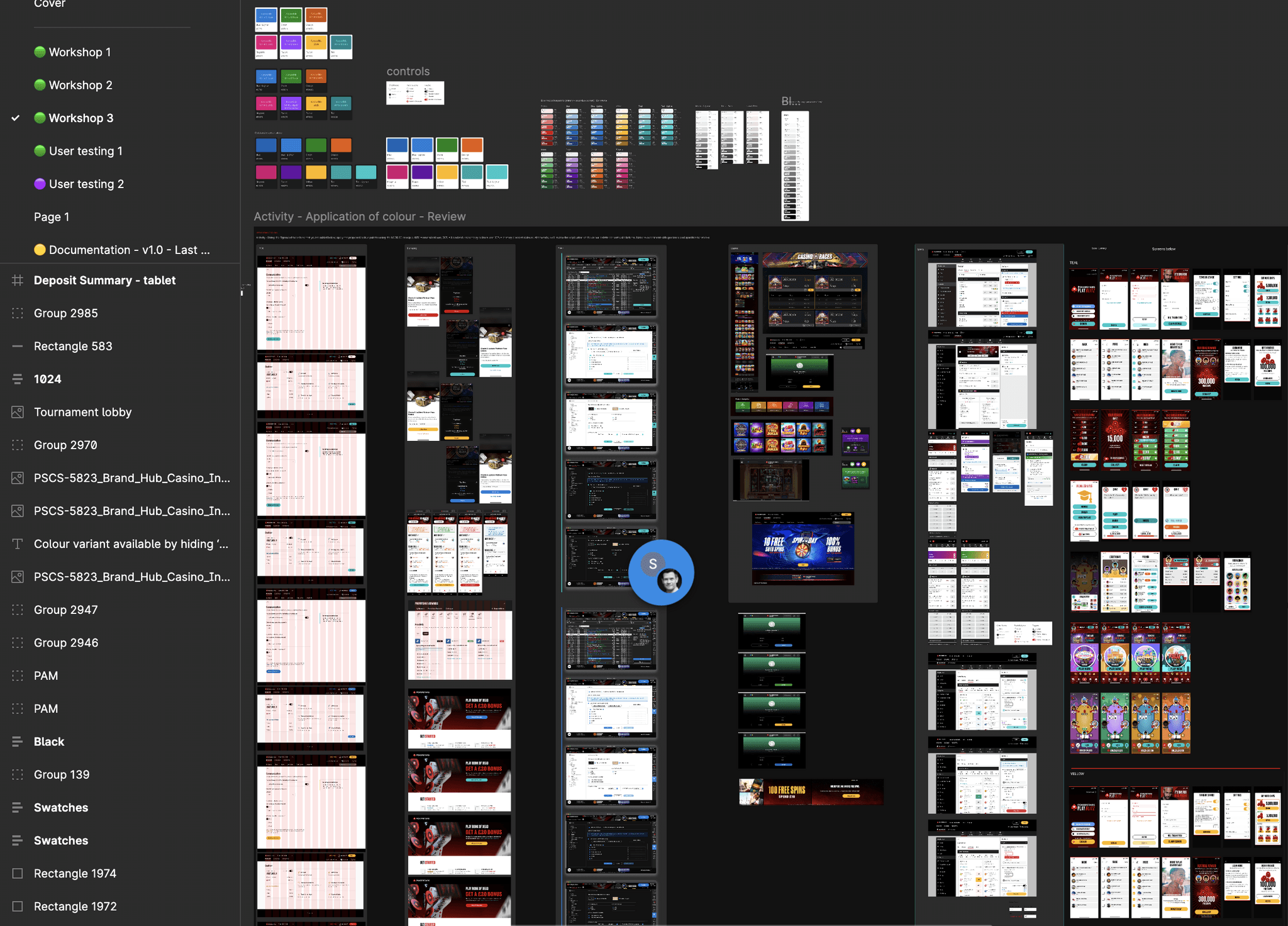
Styleguides developed through design workshops
In a design system workshop that involved few designers from each product vertical from PokerStars to create style guides that we an carry forward and use it on our products. Some of the outputs are below:
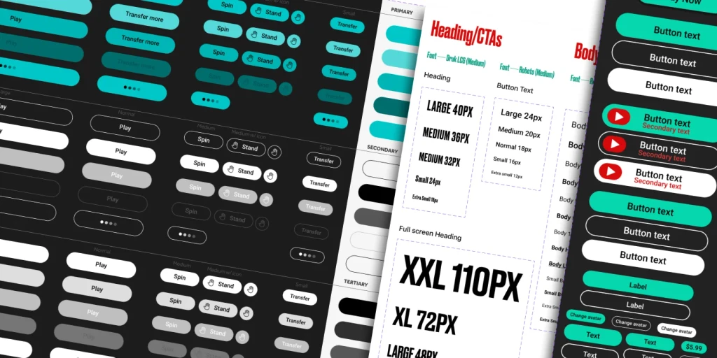
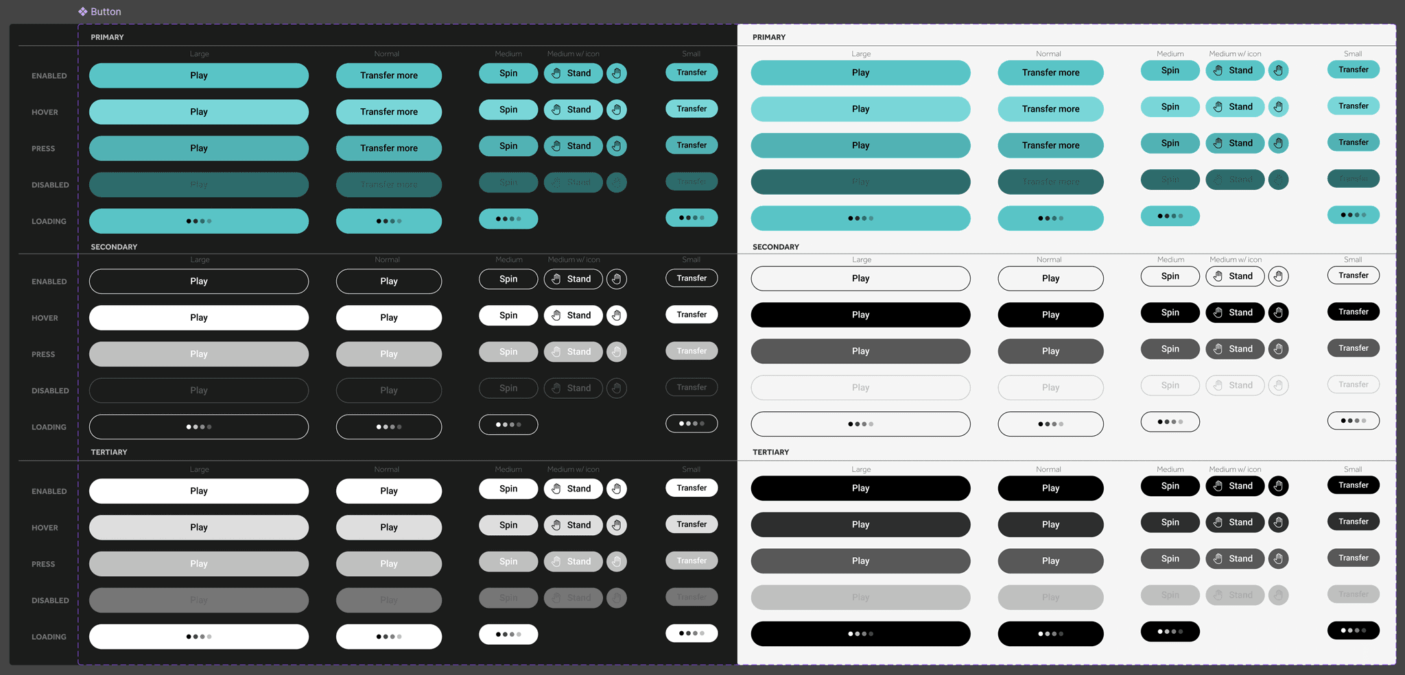
New styleguide/toolkit and design system establishing components, variables and UI specs
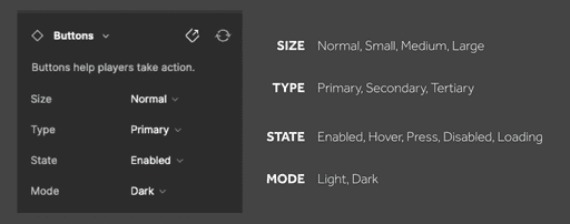
Button component variant properties defined so that single component can be used across many screens.
Many variants of the single Button component
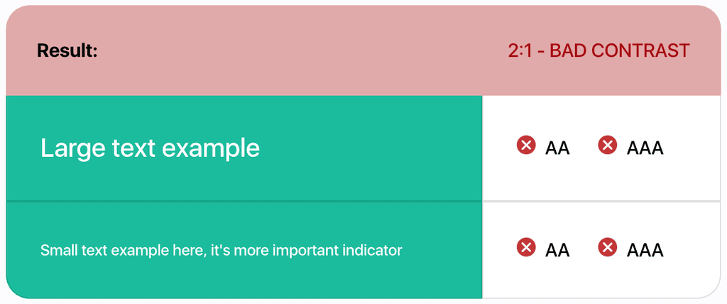
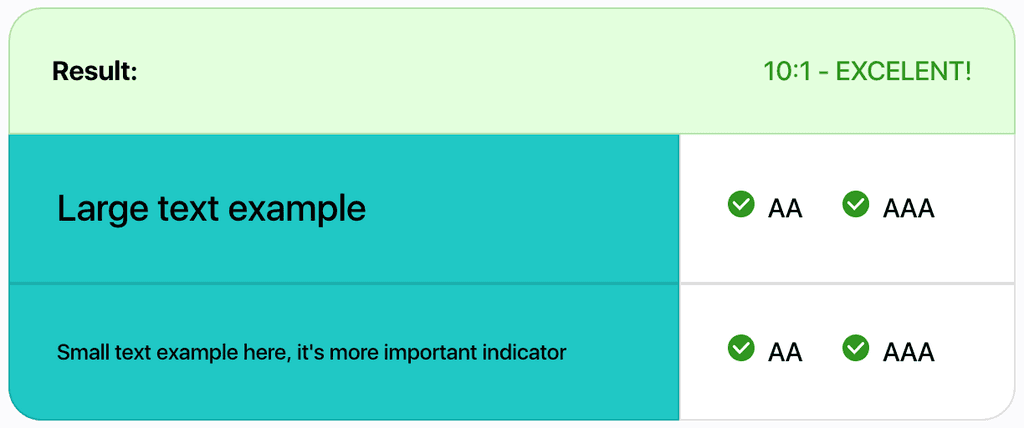
WCAG Accessibility in New Design System
The older call to action button was failing WCAG accessibility standards. But the new button is made accessible.
Old version CTAs: Not meeting accessibility standards
New version CTAs: WCAG compliant
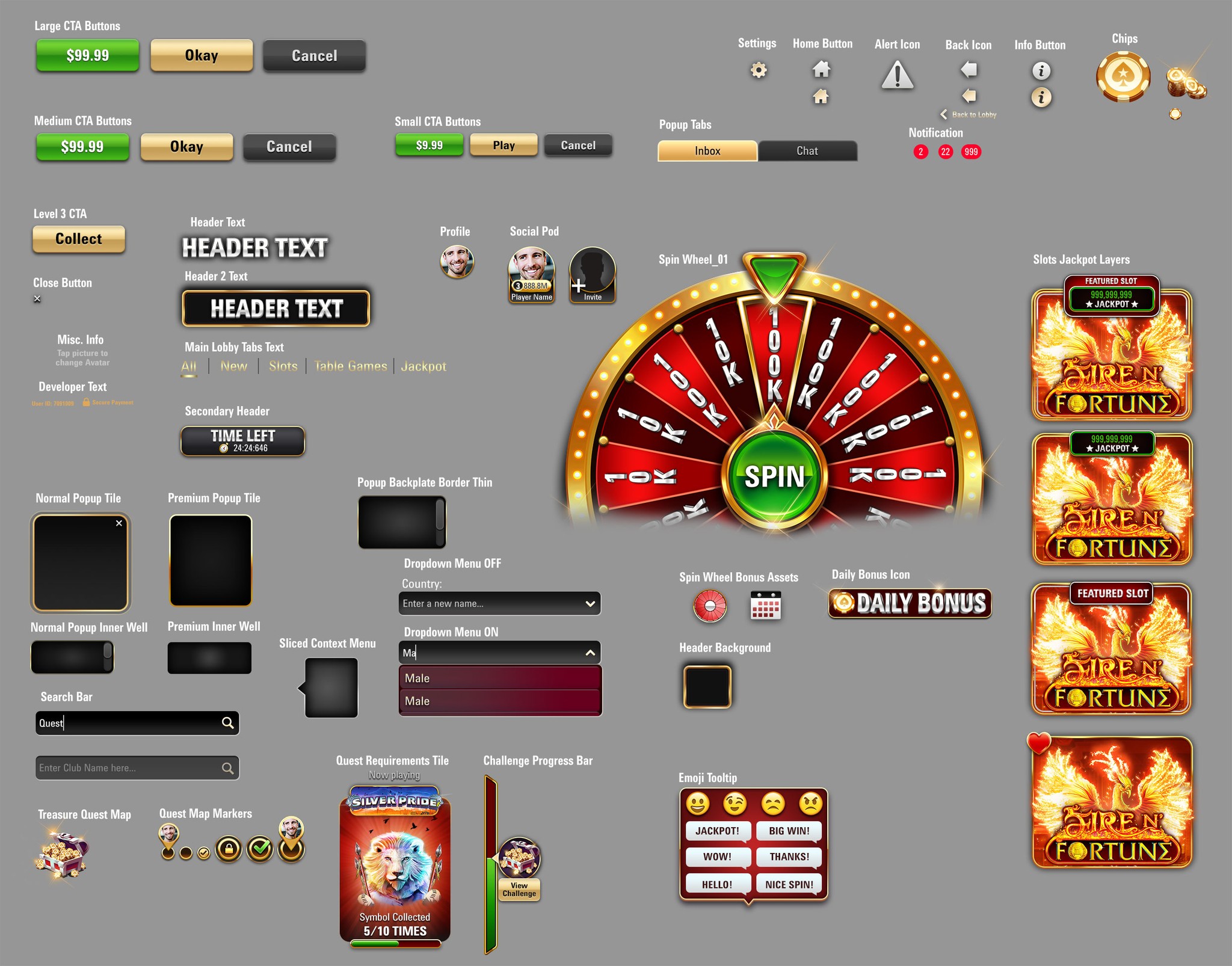
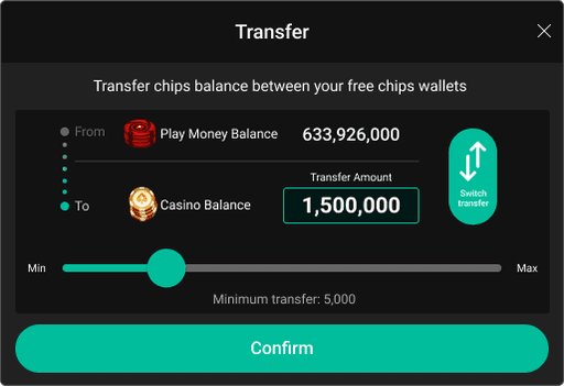
Design System updates to Web and Mobile interfaces using Figma
New design system was incorporated to ensure an updated, company-wide uniform design language.
Web
Mobile
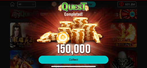
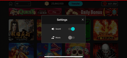
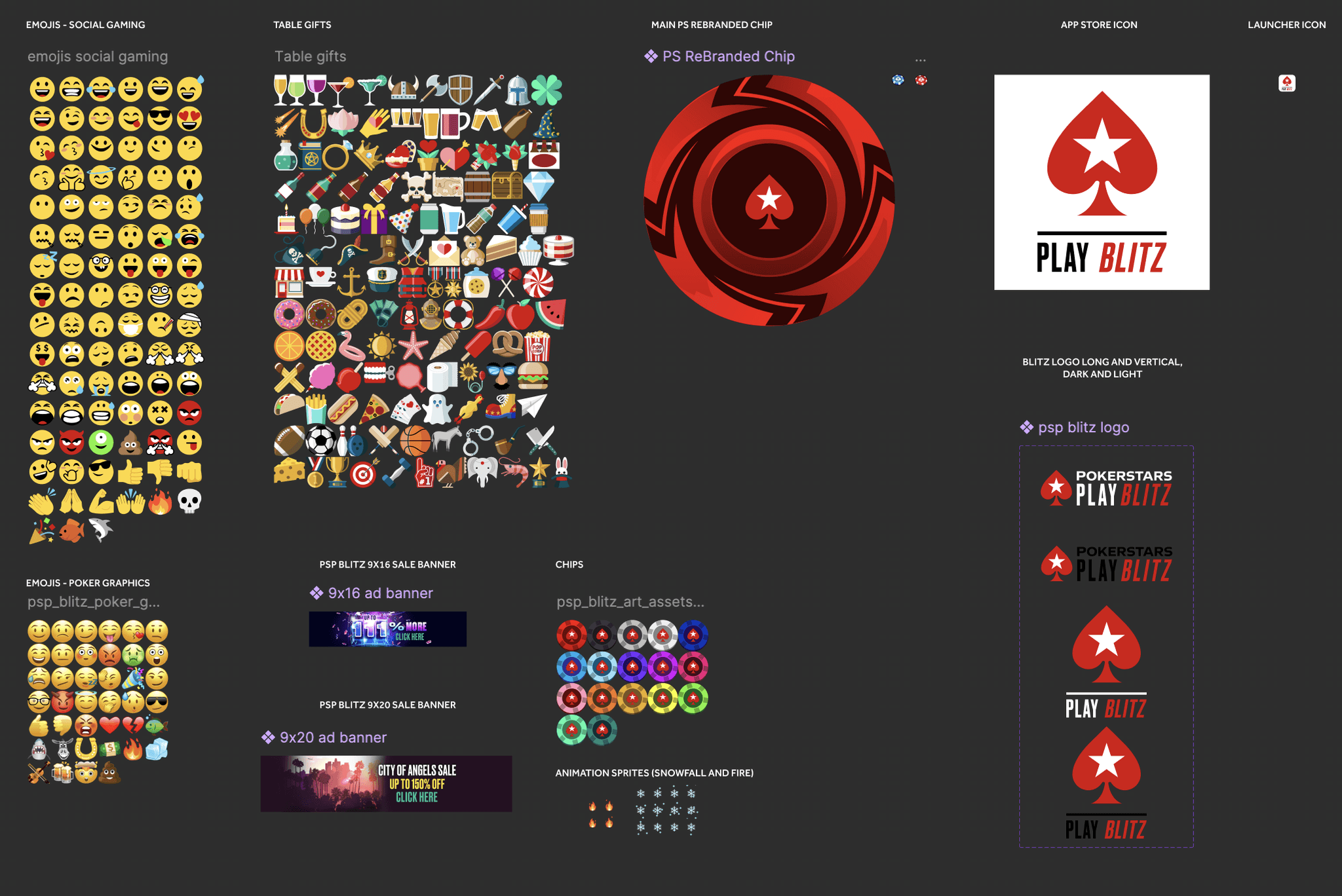
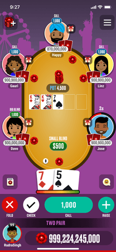
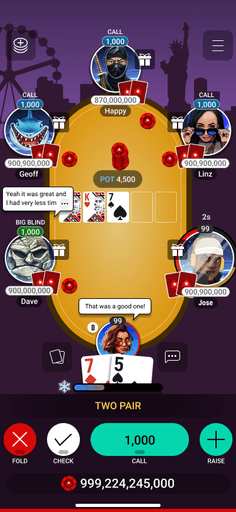
Product 2: PSP Blitz, mobile
Created Design system for Blitz in Figma
Every graphical elements in Figma had to be organised as componenets and their instances and labeled to function as a toolkit for both designers and developers.
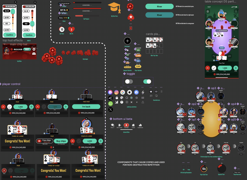
Alpha and Beta Figma files were different versions with their own components. The instances were linked locally from their own pages in the file.
Accessible CTA for new mock ups
Older buttons had poor accessibility. New buttons have great accessibility complying to WCAG standards.
Old version
New version
Dark and Light mode styleguide and design tokens using variables in Figma
I created variables using the style guides in Figma so that each screen will have its own darker or lighter version in Figma. This implementation in Figma makes it easier to switch the colours on different screens at the click of a button in Figma. Allows designers to create multiple screens for a user flow.
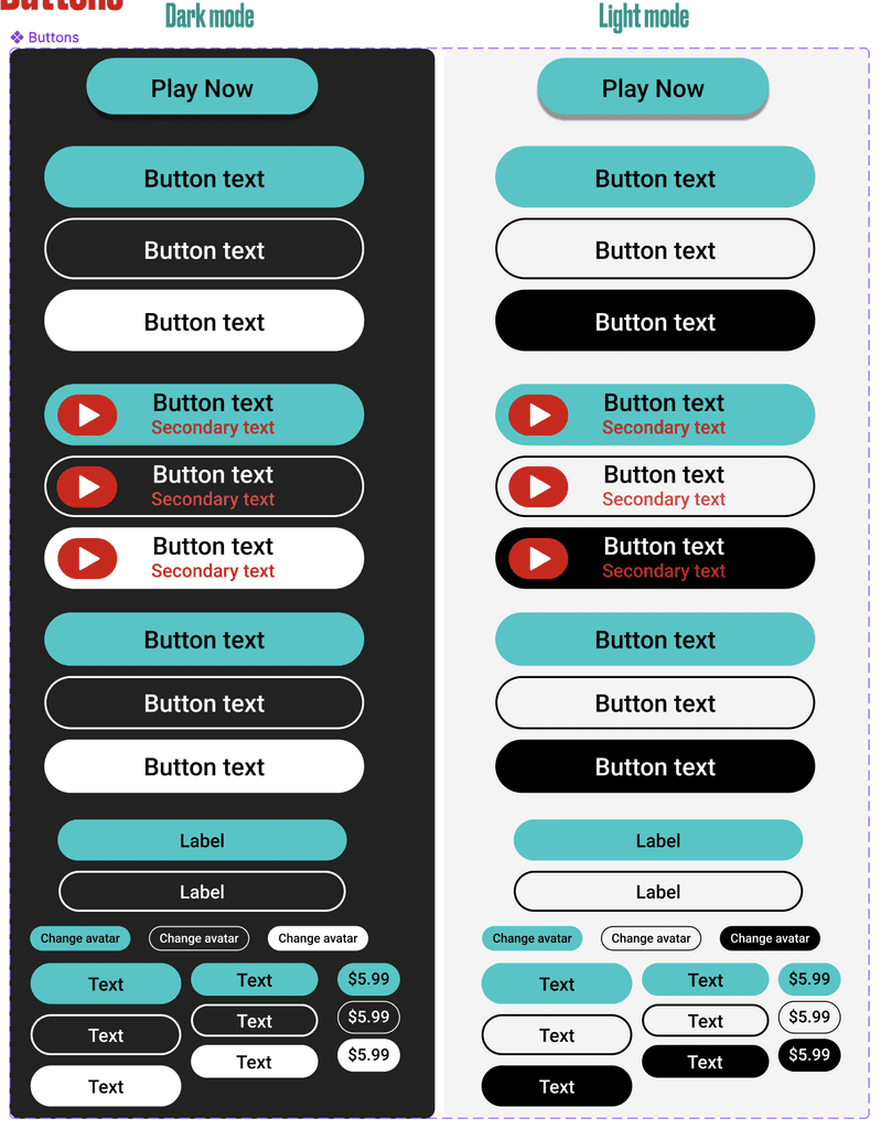
Use of Figma variables to change the colours that switch automatically when changing from dark mode to light mode.
Provision for dark mode and light mode were introduced to make the app more accessible and adhere to app store guidelines.
Figma Design systems Learnings
It was a demanding task to Collaborated closely as a multi-vertical design squad adhering to various product portfolios is quite a demanding task.
This required numerous sessions and teamwork on several Figma project files.
One of the groups was not familiar with Figma, therefore transitioning assets from Adobe Photoshop to Figma and resolving similar dependencies was tackled successfully.