
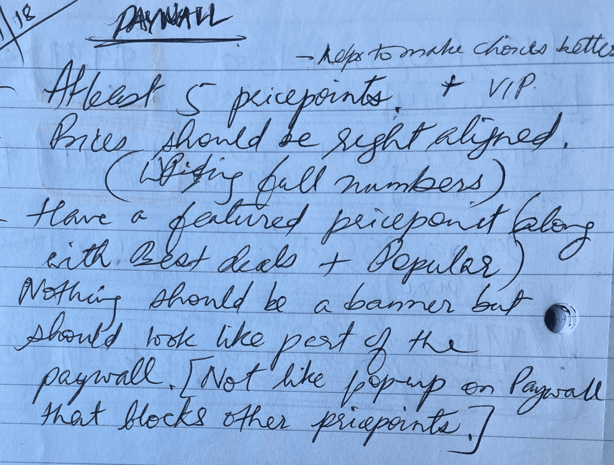
Boosted 30% Sales after Paywall redesign
2018 | ISLE OF MAN
Brief
There was a business need to increase the player revenue potential and I had to redesign the existing paywall to make it more intuitive and increase engagement.
My Role
UI/UX (Product) Designer
I was responsible for re-designing the existing paywall by making it intuitive. I conducted user tests and iterations of designs closely collaborate with design, product, development to get it LIVE from concept to completion.
Other team members:
1 UI Artist
1 Illustrator
1 Junior Animator
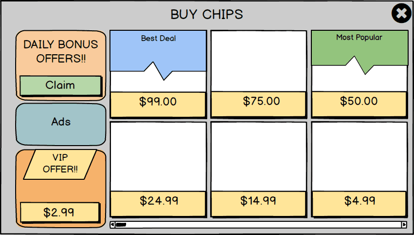
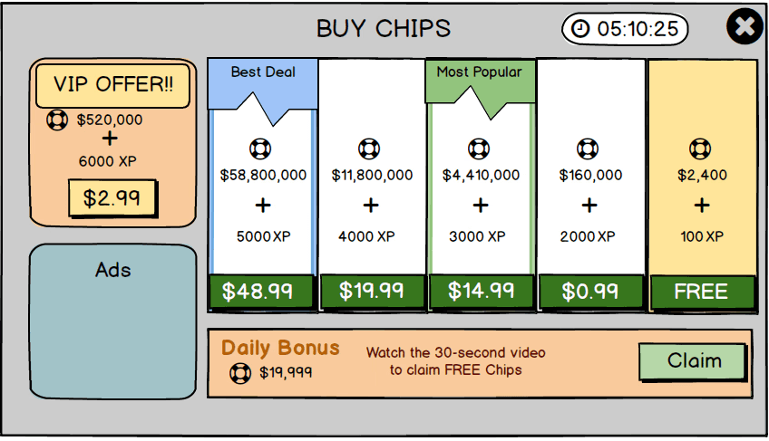
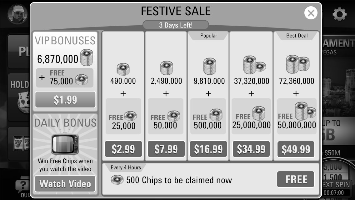
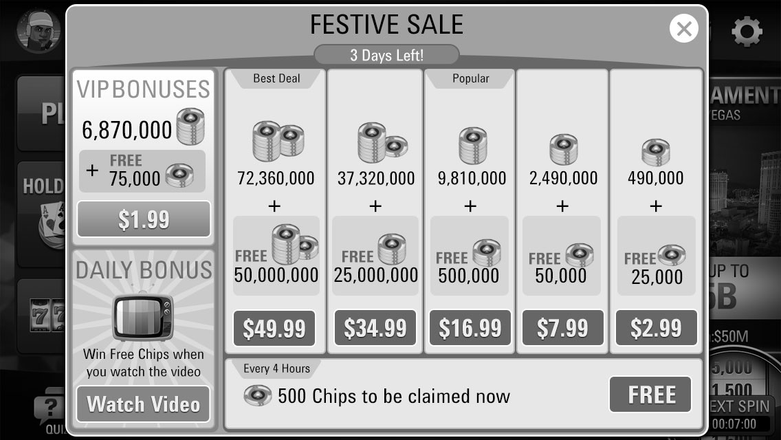
Final Designs
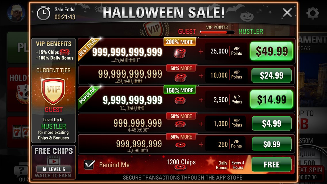
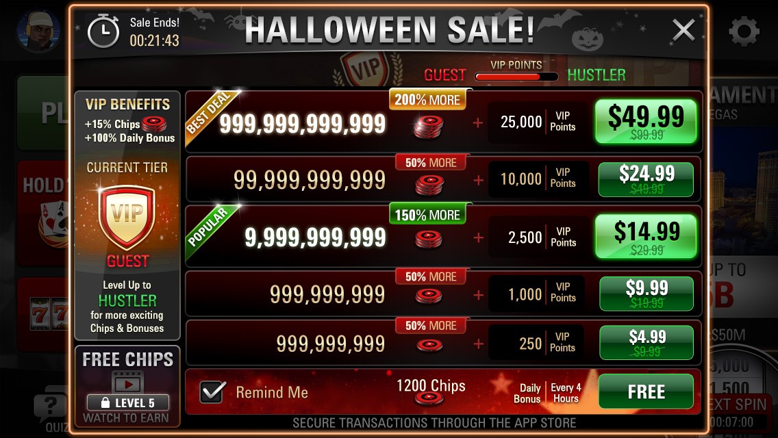

New Paywall metrics
The redesign is intuitive and proved profitable to our organisation, aiding users toward clearer action items on the paywall, which led to a rise of 30% in revenue from our monetising players.
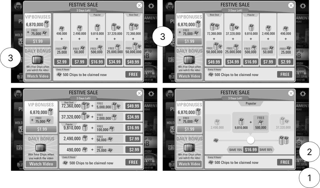
Design Process
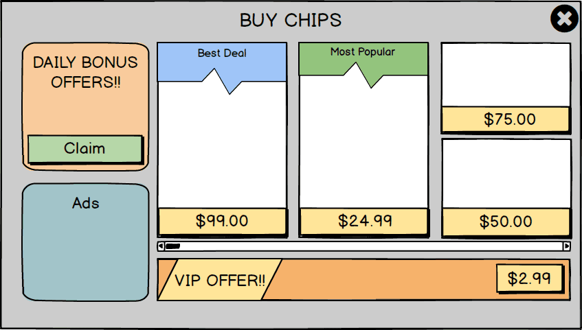
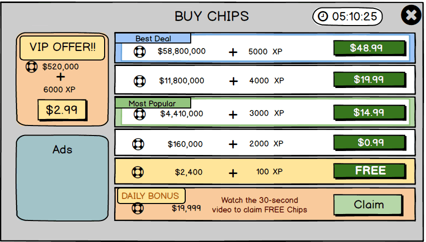
Older Paywall before redesign
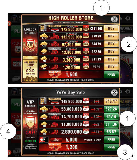
Problems
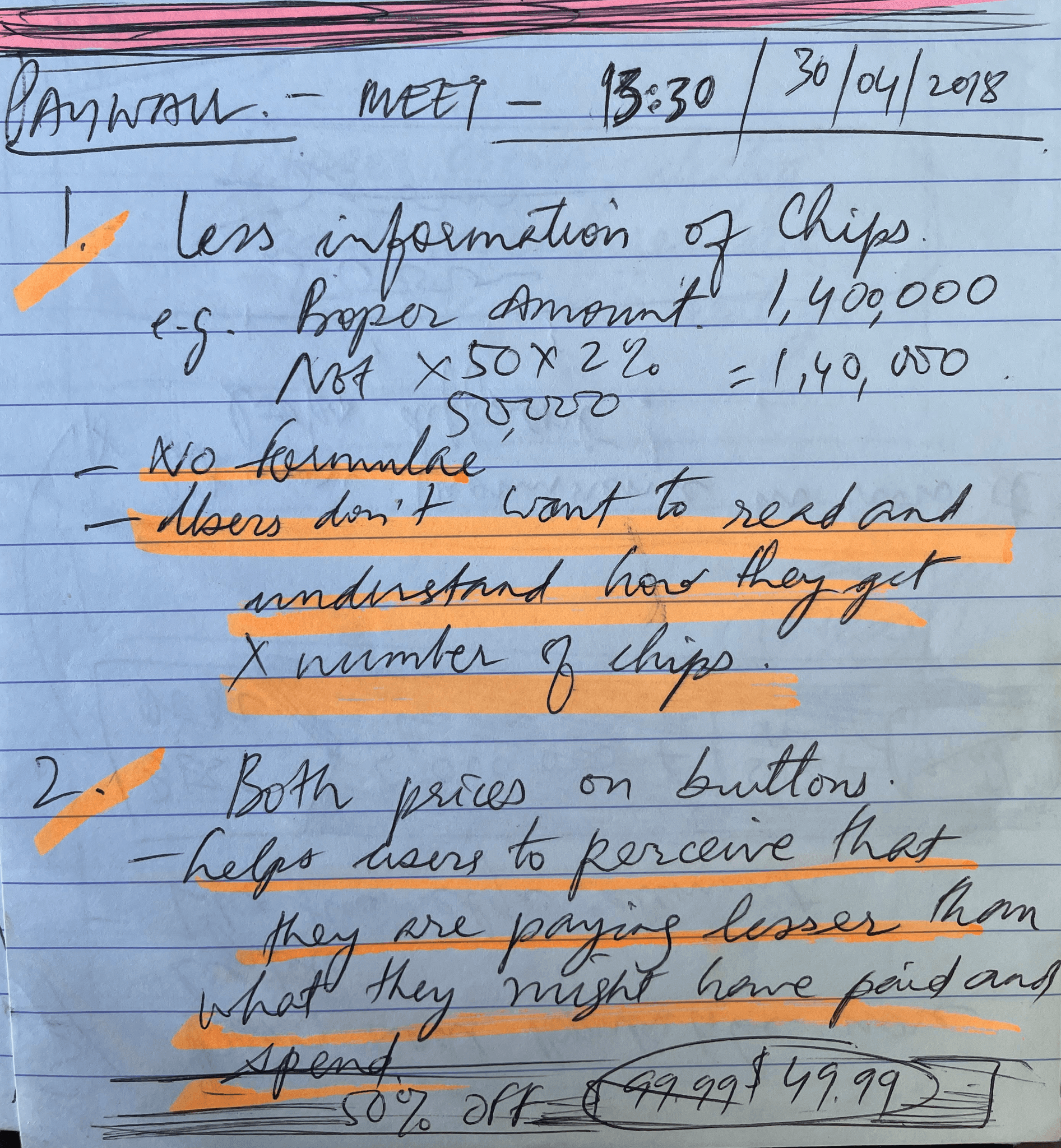
Price points were inconsistent in normal and premium paywall.
The most popular or Best deal price points were not highlighted properly.
Delayed decisions to make a purchase on the paywall.
The gold bars did not have a real purpose in the game other than the VIPs those who use it for progression in their tiers.
Possible Solutions
I had to reduce complexity by taking out irrelevant elements like gold bars, highlight Best and Popular deals and simplify layout and make it more intuitive.
Market Analysis
An important component called Paywall required some competitor analysis and review to ensure our alignment with the prevailing trends
Competitor Analysis Takeaways
Their paywalls had marked out special deals areas to grab attention.
Their price points were always on the Call to Action buttons unlike us who were all over the place.
They called out Sale Discounts very clearly.
They did not have any confusing unnecessary elements on the paywall.
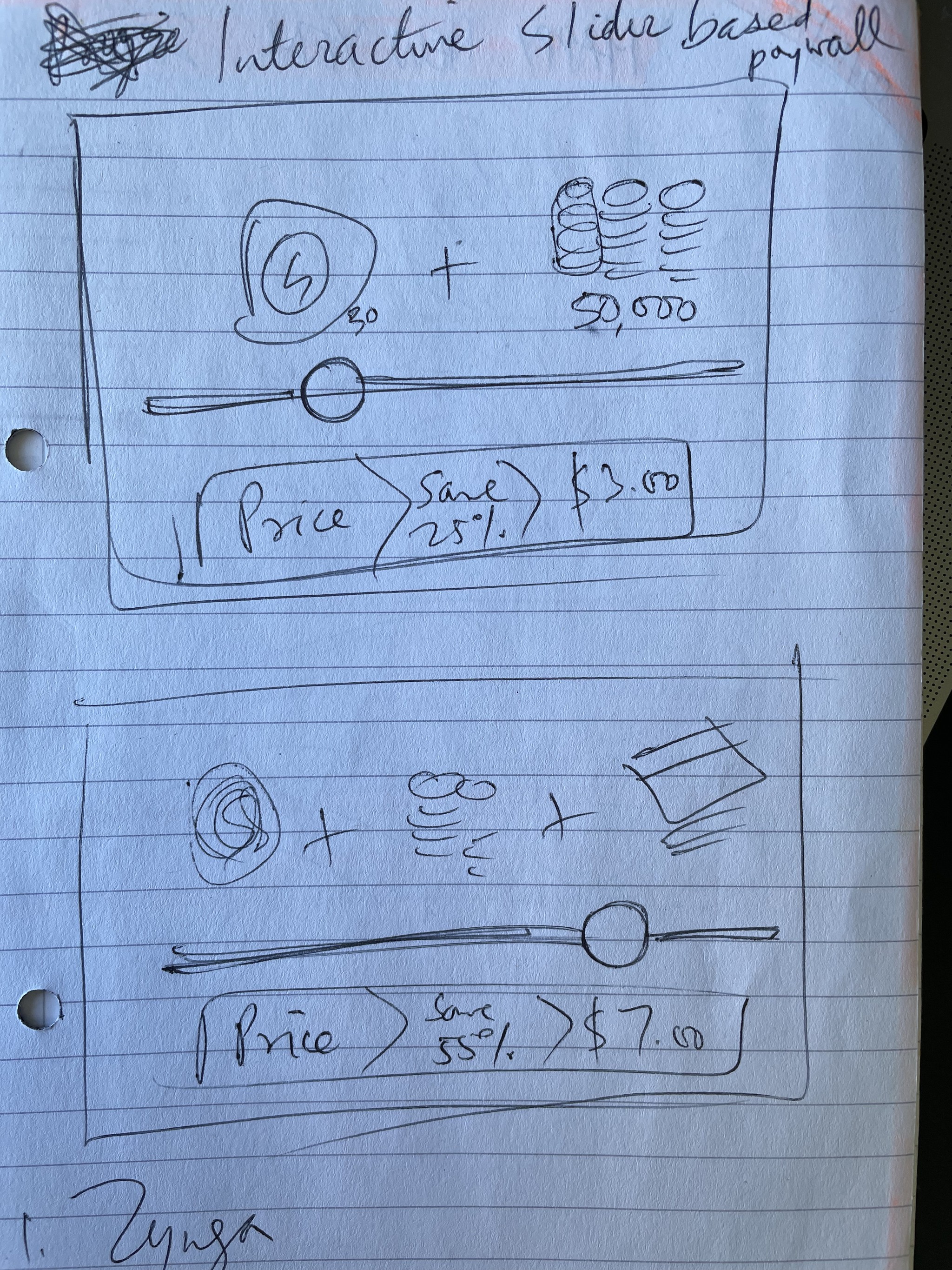
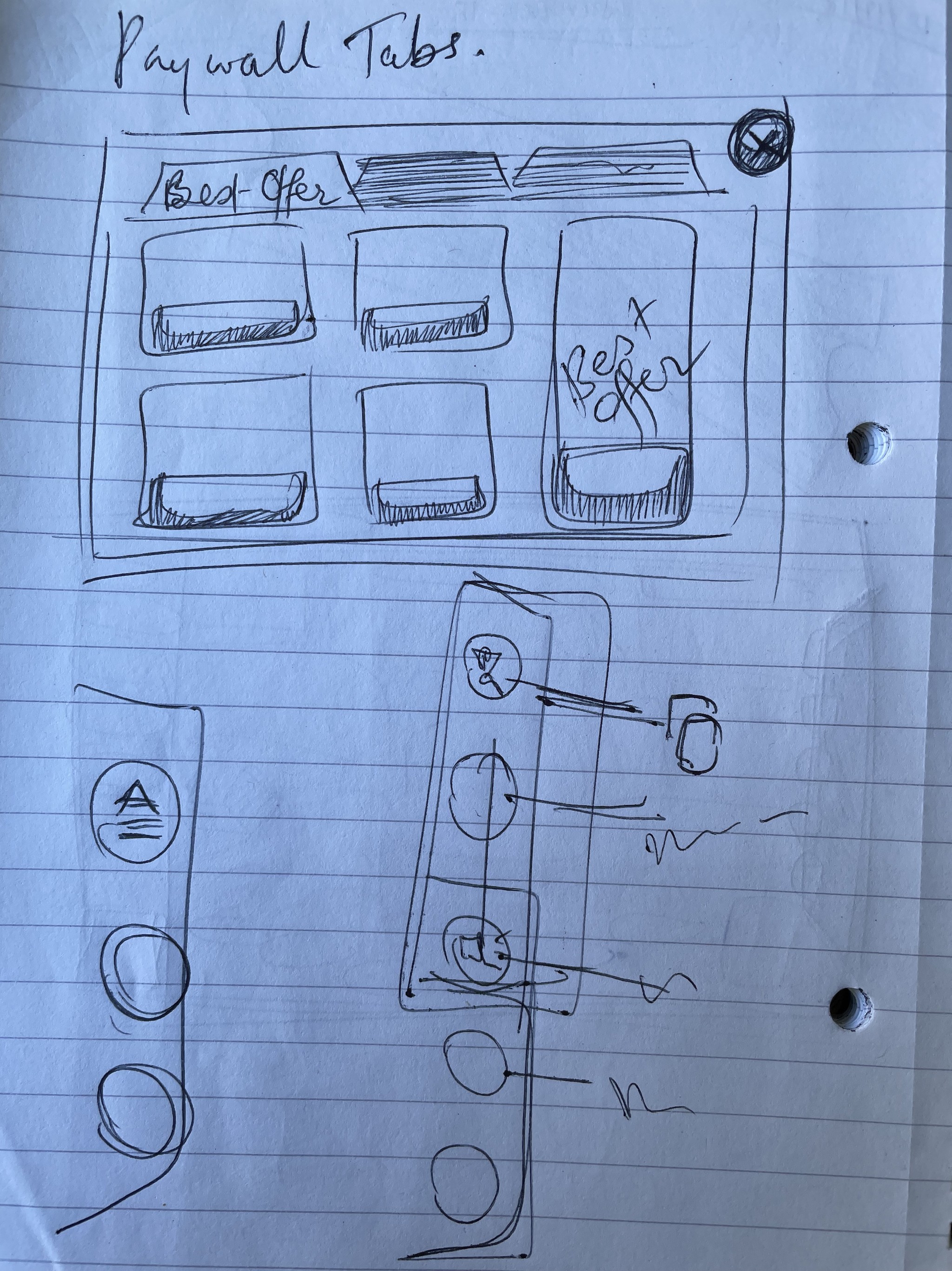
Paywall concepts + paper wireframes
After deriving conclusions based on competitor analysis, I did many paper wireframes to look at possible solutions of the re-designed paywall.
New paywall initial wireframes in Balsamiq and later in Illustrator
The sketches were transferred to a digital format by creating wireframes in Balsamiq and many different options for stakeholders to take a decision based on the layout. We tested the wireframes for hotspots.
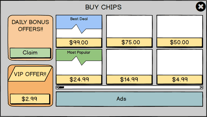
Once the Balsamiq wireframes were good to go, I made the detailed greyscale wireframes in Illustrator/Photoshop in vector which was easier to manipulate. This resulted in many iterations of the 1:1 scale paywall we wanted for our product.
Problems identified in early stage User Tests
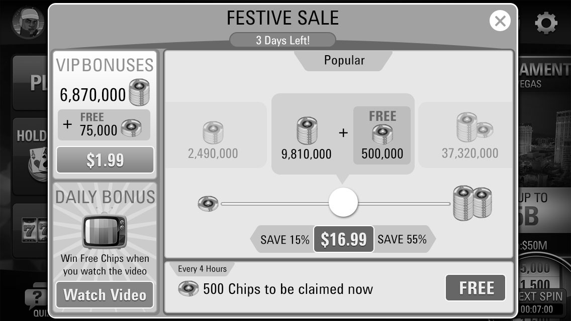
Testing at an early stage identified the specific layout that we wanted to go for coloured visuals. Peer tests and competitor analysis along with wide surveys pointed us towards vertical layout and many users had problem using sliders and interactivity in the paywall.
Problems identified
Users were not confident on the interactive slider.
Users could not control how much they would like to purchase and spend (problem of accuracy)
It was easier to compare amounts when they are vertically presented than compressed in horizontal cards.
Coloured mockups used for further testing for qualitative analysis
Modifications were made to the structure and aesthetic components in response to user preferences identified during testing.


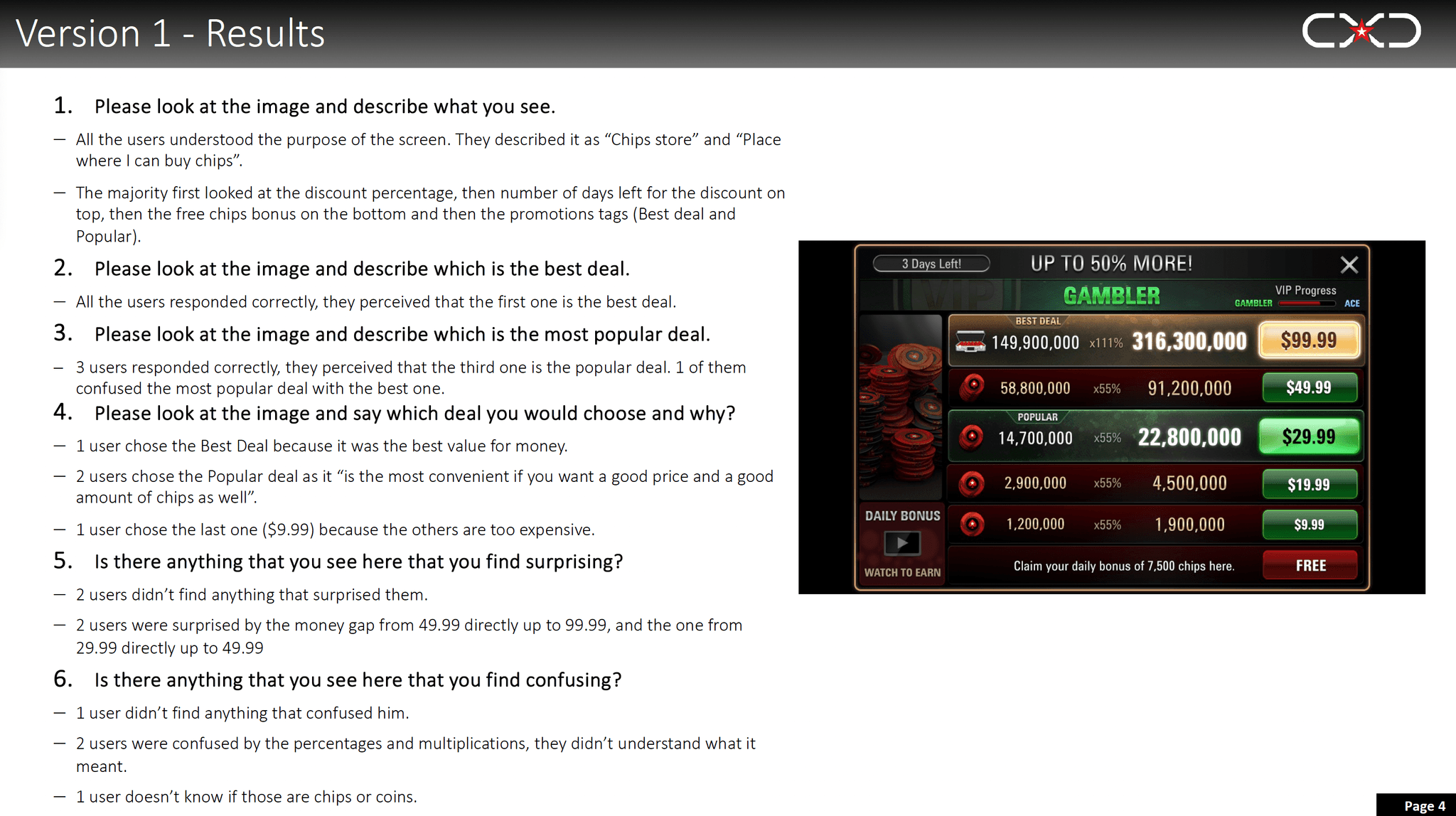
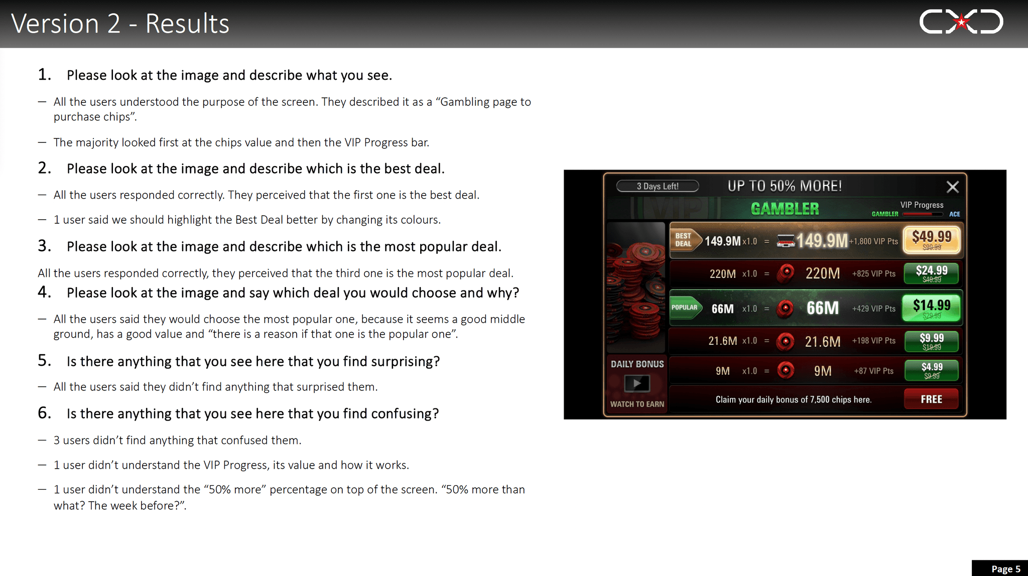
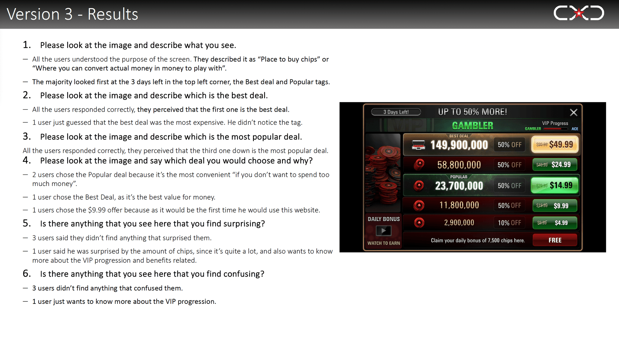
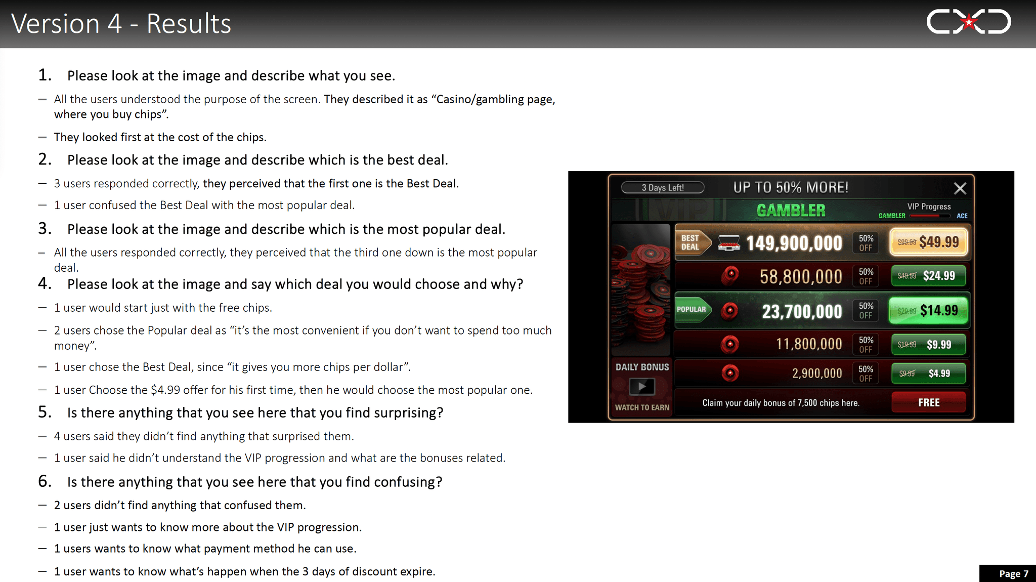
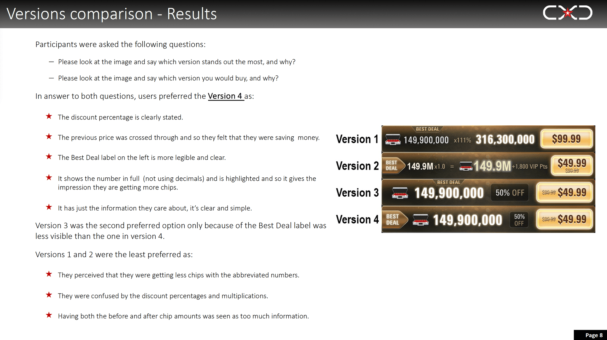
Usability Test Report
The application's paywall underwent user testing to discover the optimal choices. This procedure was facilitated by the internal user research division, which furnished us with a report containing user feedback and predilections. Below is the user research report.
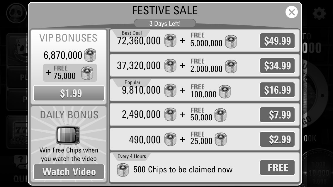
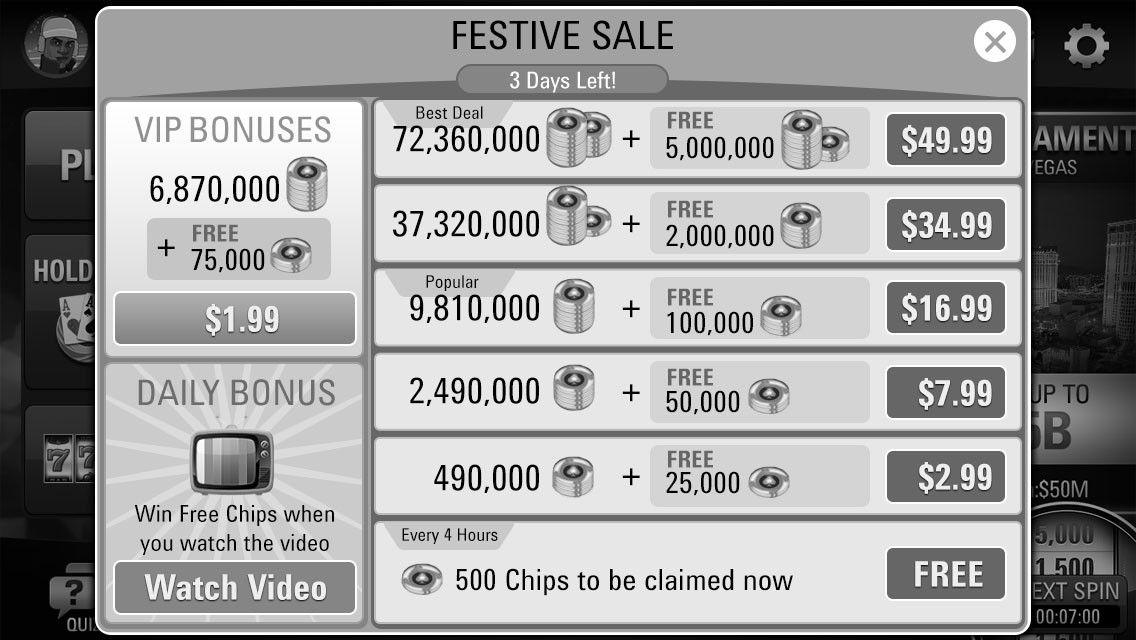
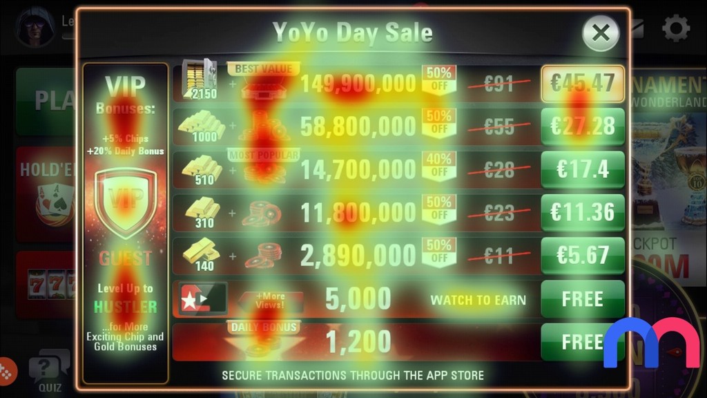
Paywall UI - Heat mapping analysis
We used an in-house paid heatmapping tool to analyse the designs and make corrections based on data. (Below graphic is for representation only.)
Old paywall with many distractions before taking an action.
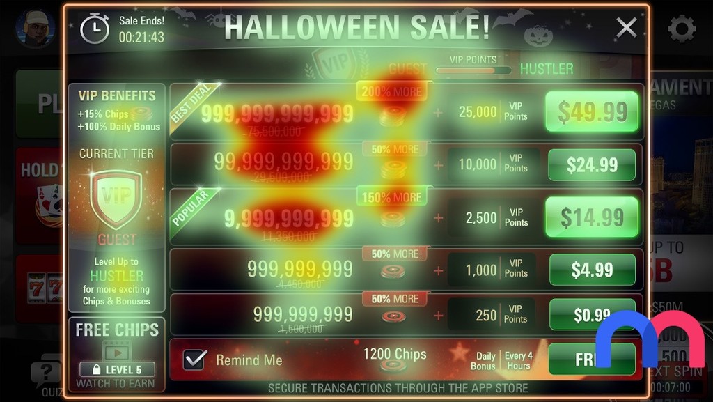
New paywall design with major emphasis only on the chips amount, deals and price points.
Decision making
I was heavily reliant on making sure optimum elements in the paywall are mapped effectively and therefore making it useful for the players to make decisions quickly. Final Art mock up decision was clarified to stakeholders based on this data.
Paywall UI - Final mock ups and refined art
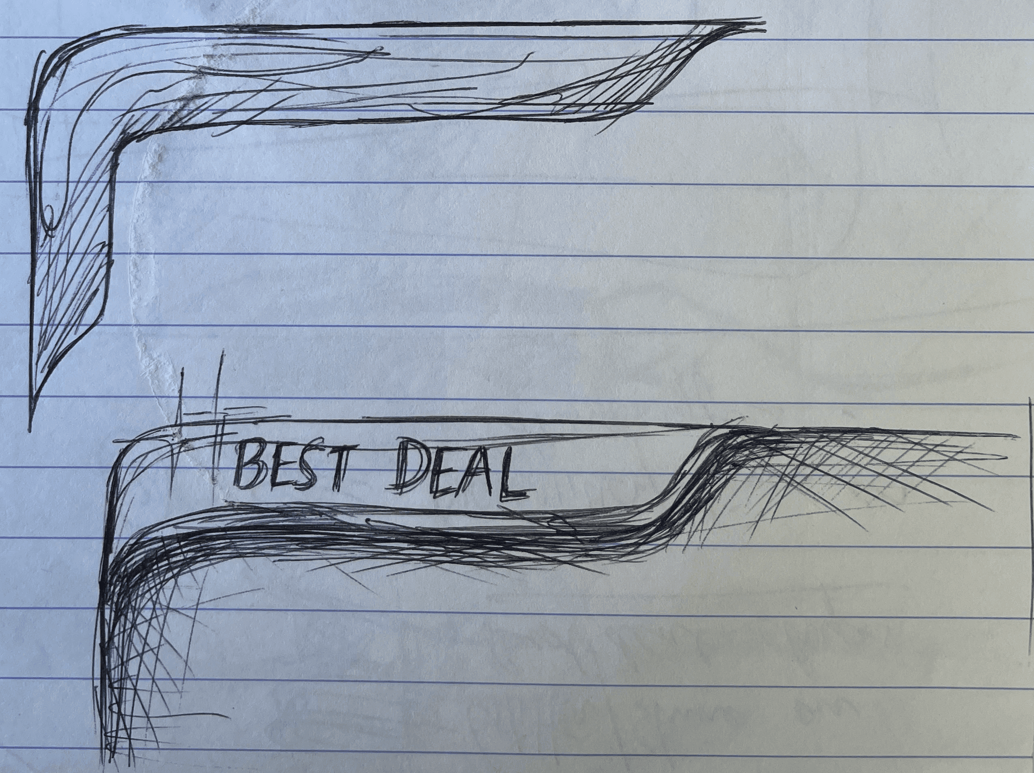
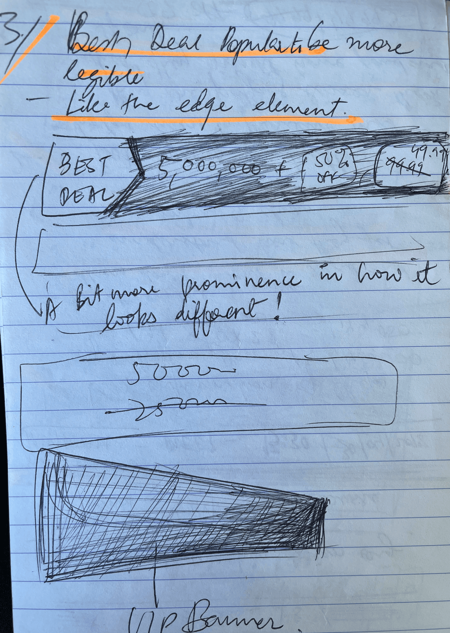
Best Deal and Popular Deal was given special treatment which went through around 30 iterations in final visual design. The user research helped us nail down on the final aesthetics and design and we were confident that the paywall once implemented will do well.
Results
The new Paywall, brought better engagement to the players with more clicks and purchases made after launch. It increased our overall player purchases and contributed more towards a positive ARPDAU in revenue.
Paywall re-design: UX Learnings
Getting wireframes quickly ready with many design options gives design team a sneak peak of the final product without coding it.
Patience is a great virtue to have when there are more than 30 iterations of the final art after wireframes are finalised.
There is a great dependence felt on User testing for design decisions on Paywall
Qualitative analysis after listening to User comments and point of view were hugely beneficial in decision making.