Challenges UI/UX : New Feature
2019 | REDESIGNED 2021 | ISLE OF MAN
Brief
To design a New feature called Challenges for new and existing players to compete in different game types and win bonuses if they finish the challenge in a set time limit.
My Role
UI/UX (Product) Designer
I was responsible for the app's New feature called Challanges and it's full development cycle, from initial ideas to final mock-ups and prototypes
Other team members:
1 Graphic Designer
1 3D Artist
Final Design
Design Process
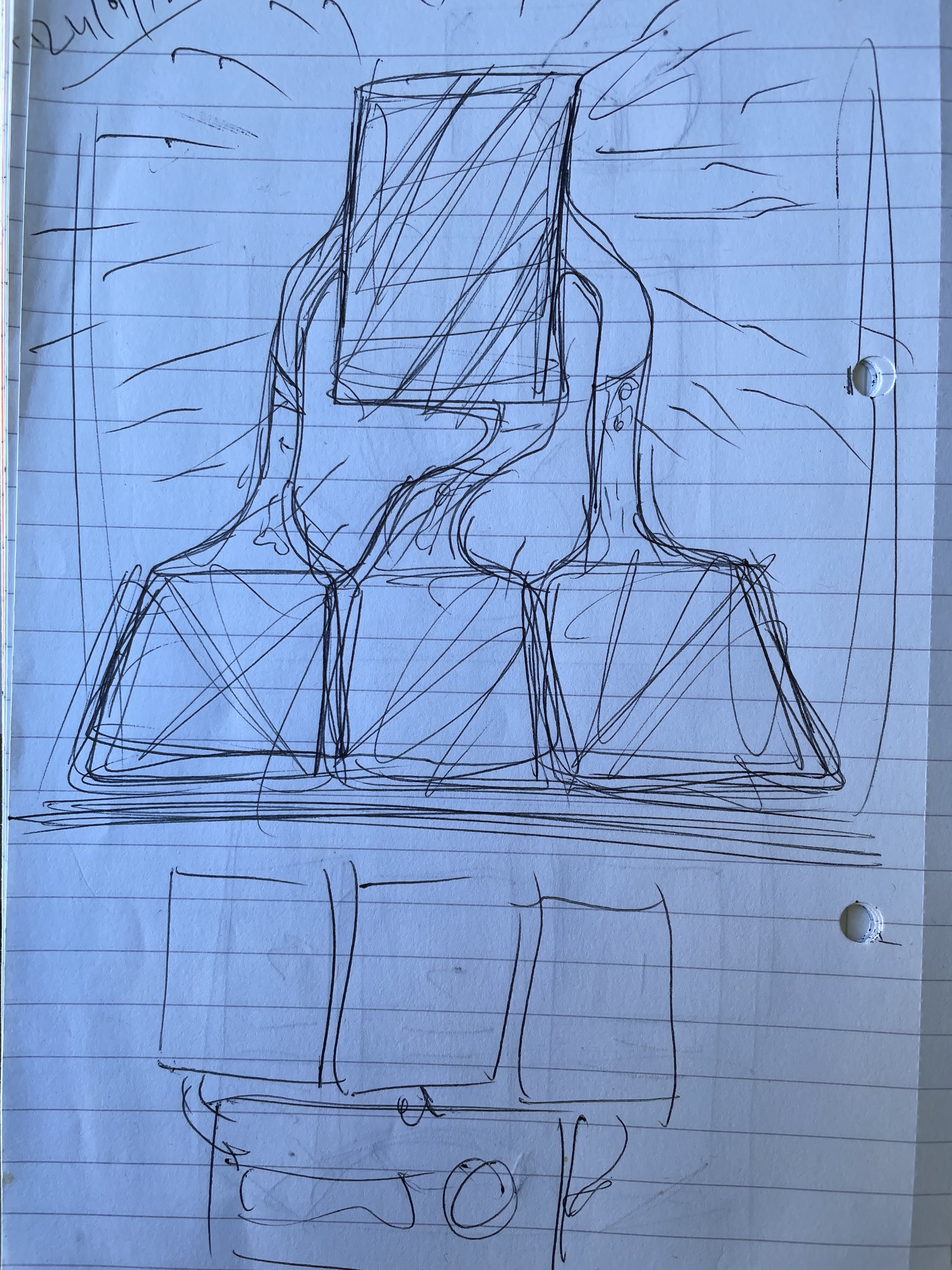
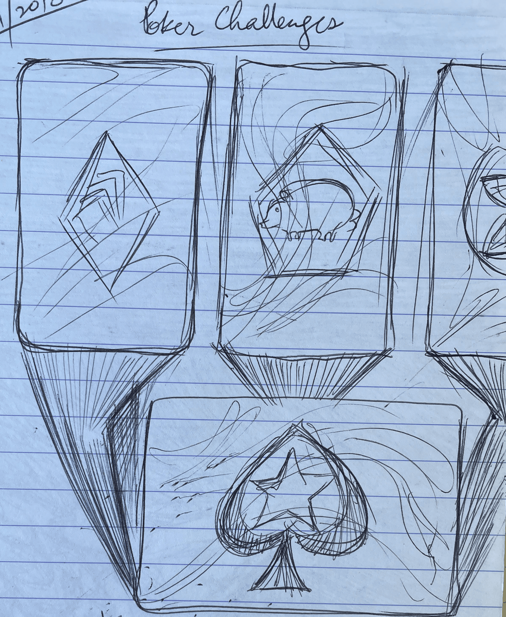
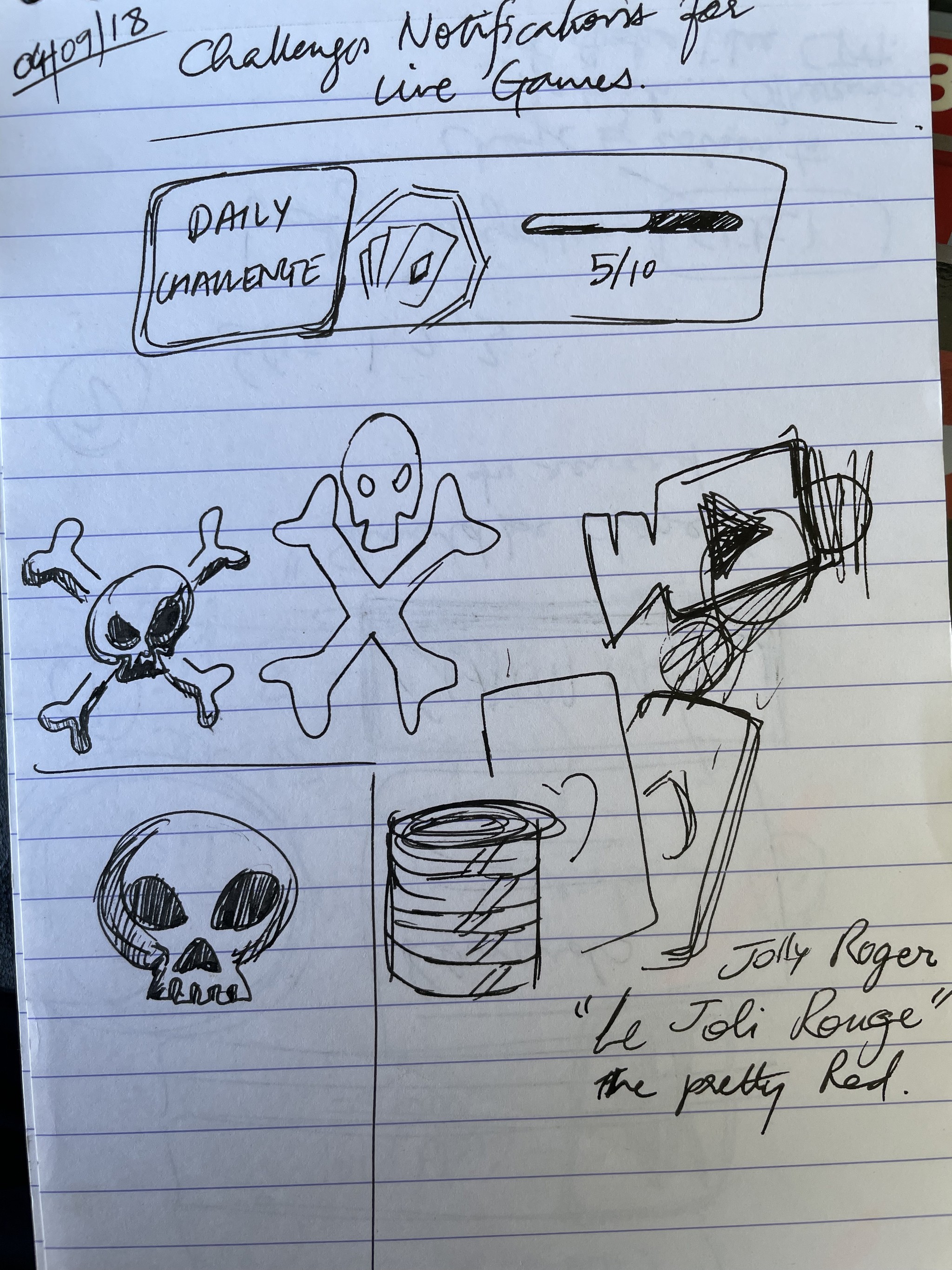
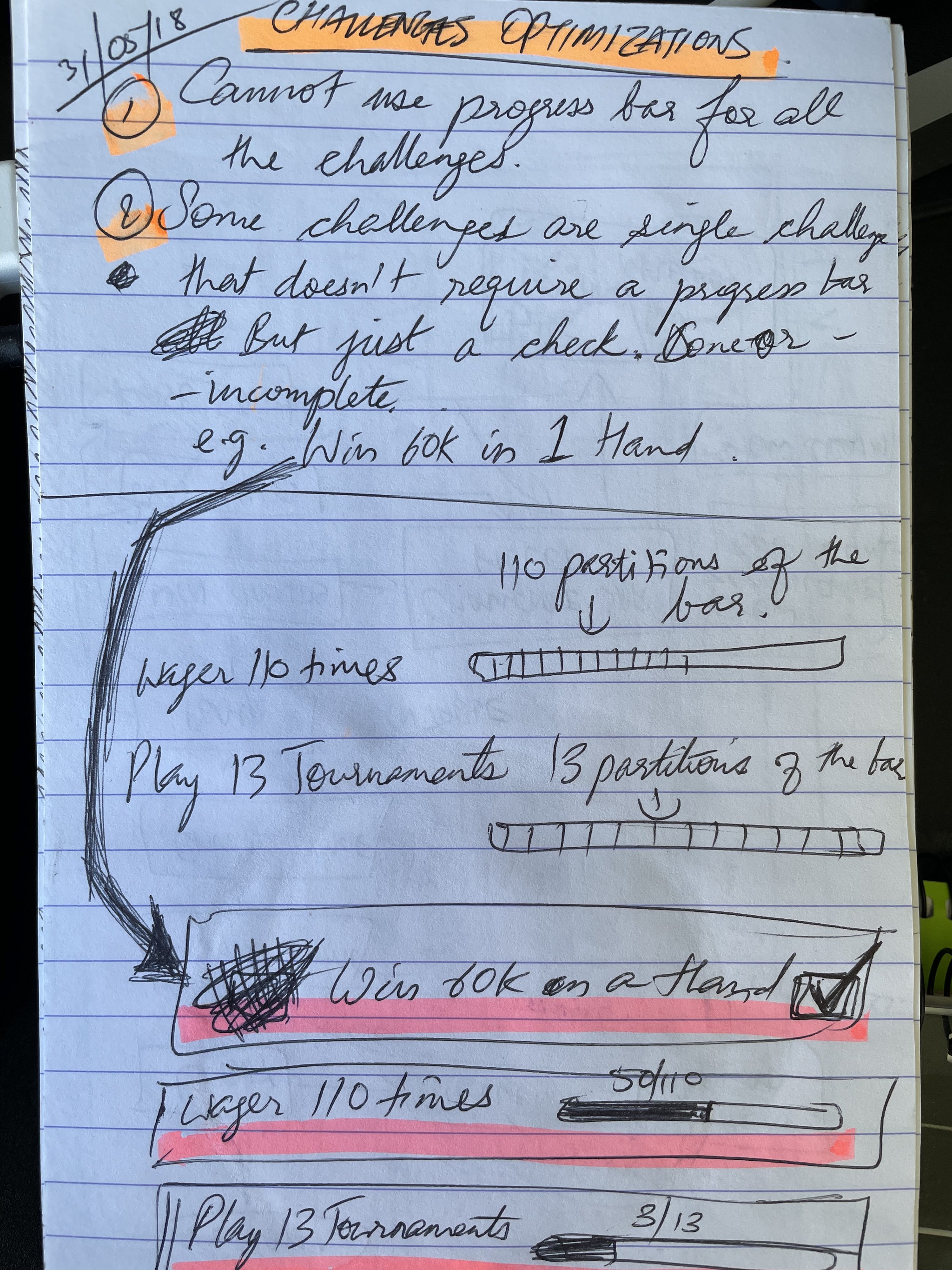
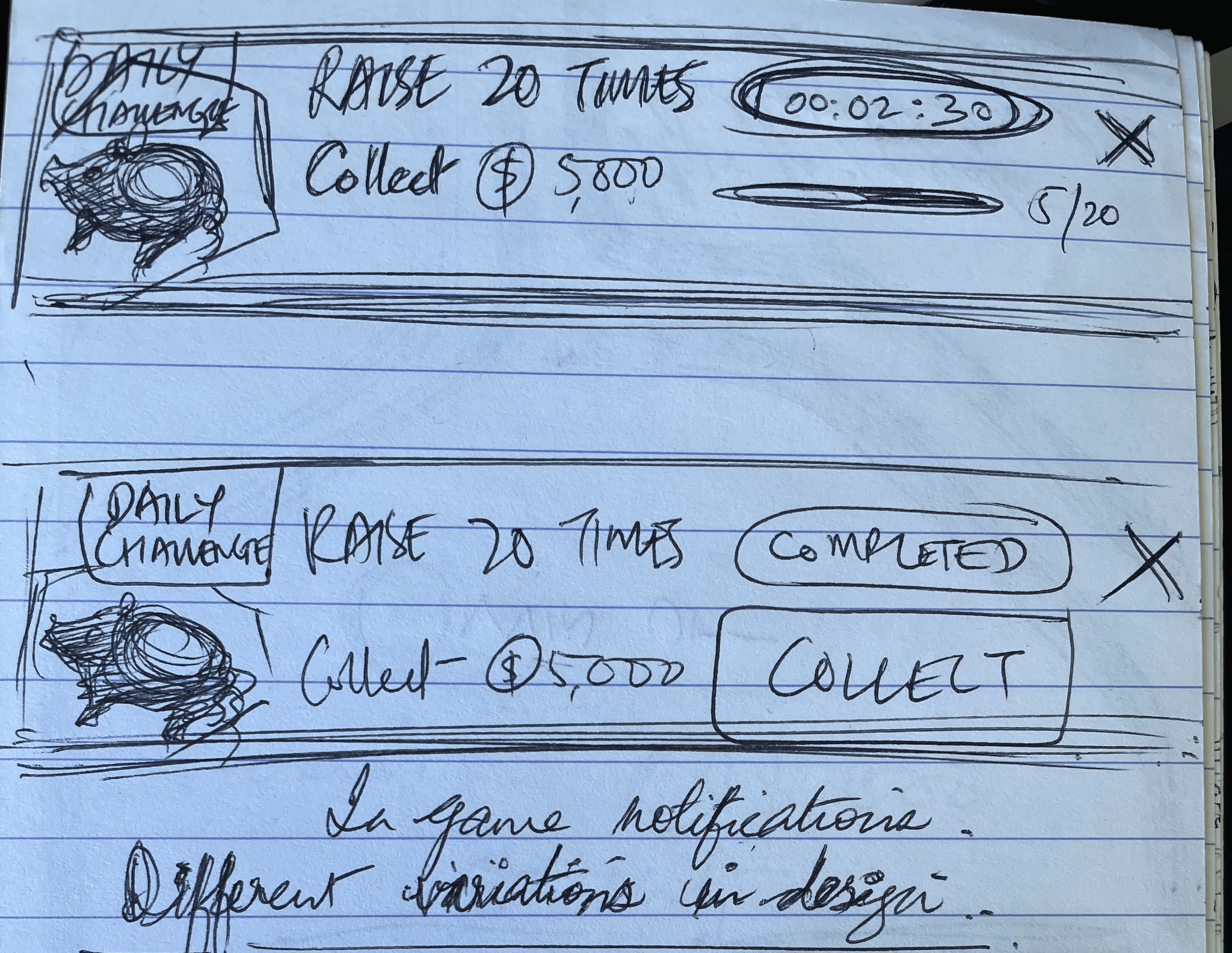
Challanges sketches and concepts
Challenges was entirely new feature for PokerStars Play mobile app. It was supposed to be large feature for existing and new players alike. Therefore, it had to be crafted very well starting with sketches
Competitor Analysis
As a new feature, Challenges required some competitor analysis and review to ensure our alignment with the prevailing trends and guarantee the user's comprehension of this feature. There were many different ways the competitors tried to approach challenges in their games.
Competitor Analysis Takeaways
Iconify elements on the screen for easily identifying challenge types.
Rewards need to be shown along with the progress.
Clear progress bar needs to be visible with number of steps or percentages as required.
Make the feature clearly visible in the game through unique illustrative / graphic style / functionality.
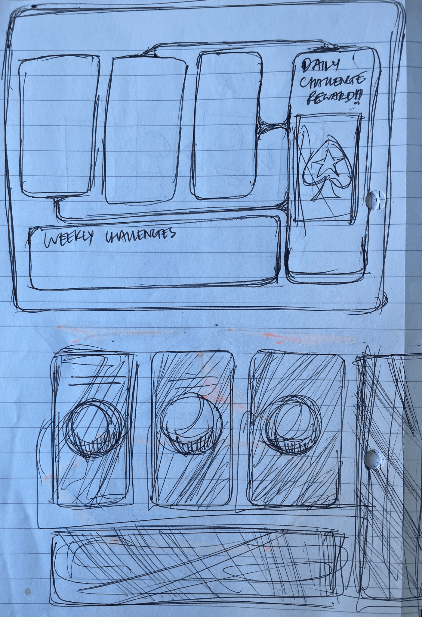
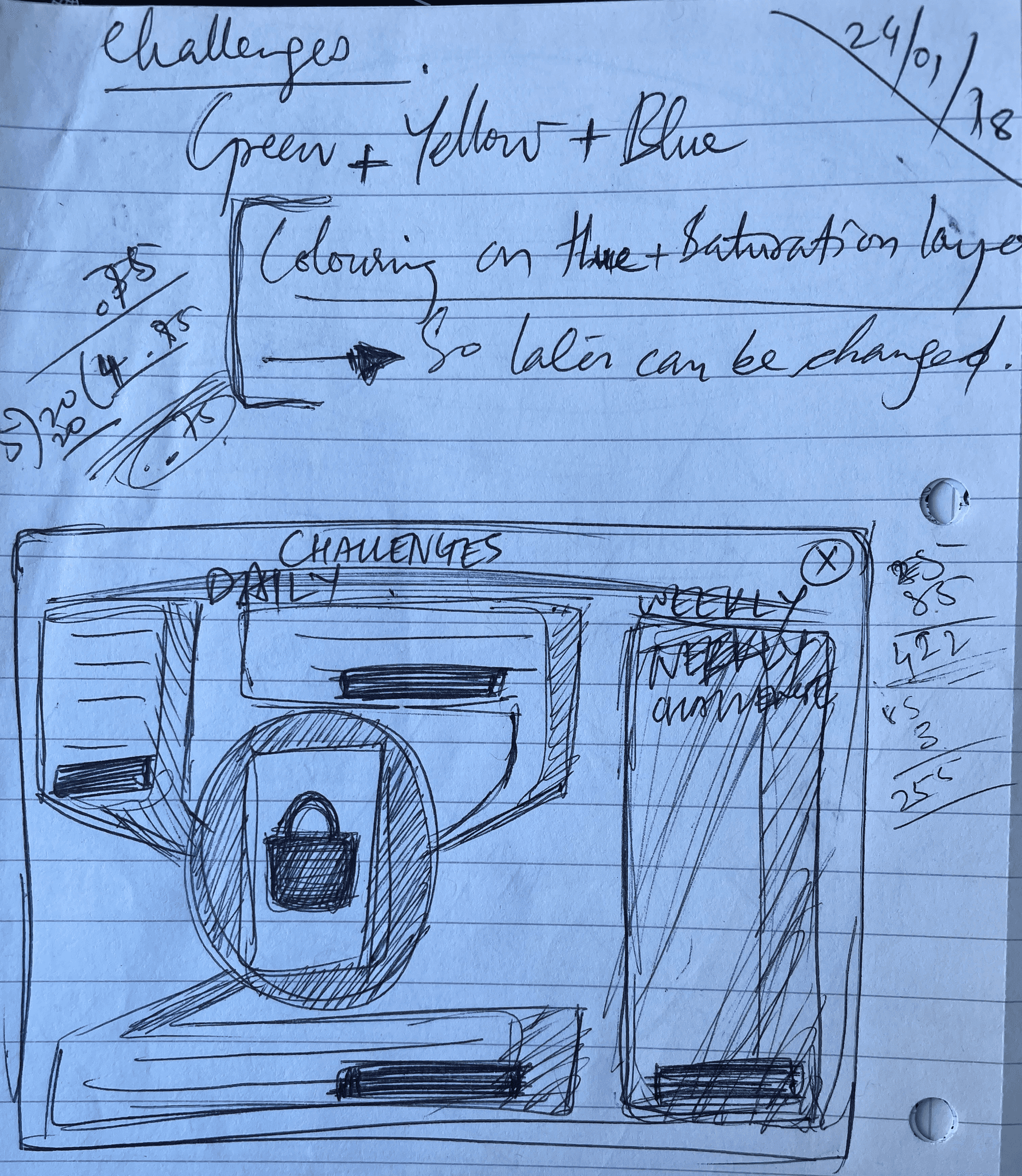
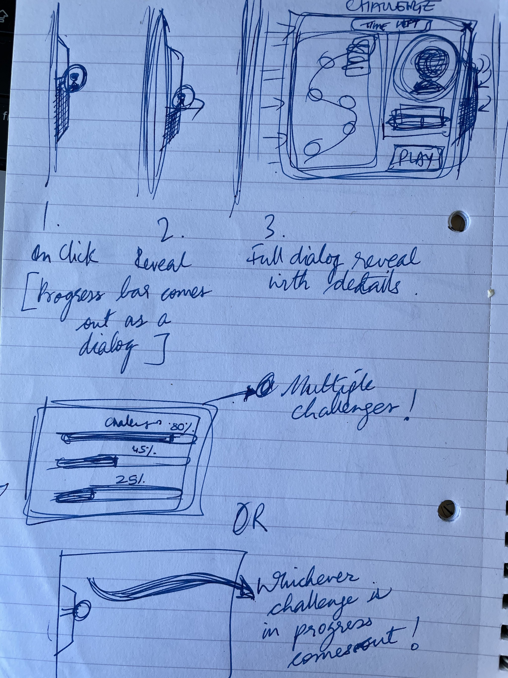
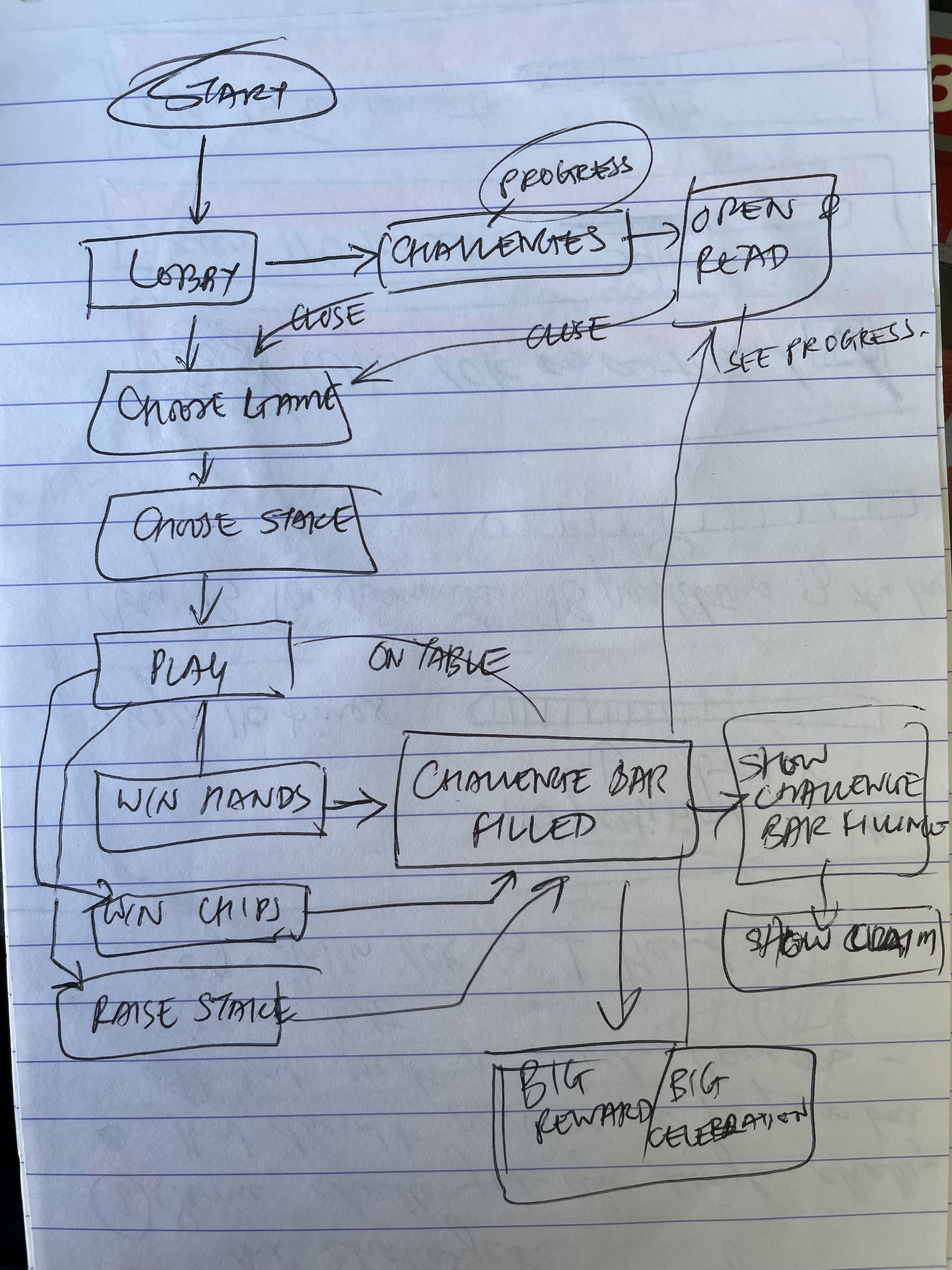
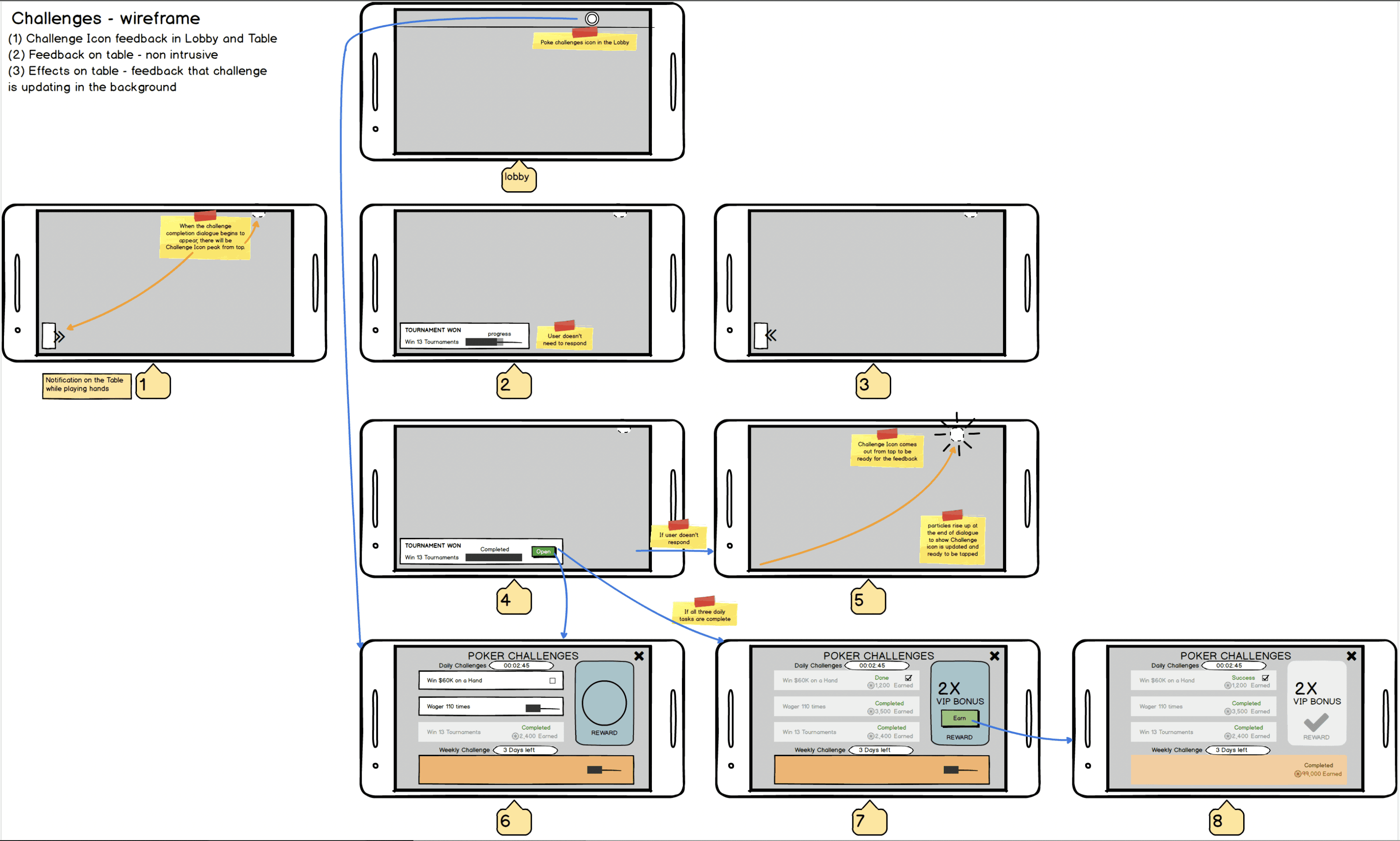
Initial wireframes
Below are both versions of the wireframes which were used as user flow after the initial structure of the challenges UI.
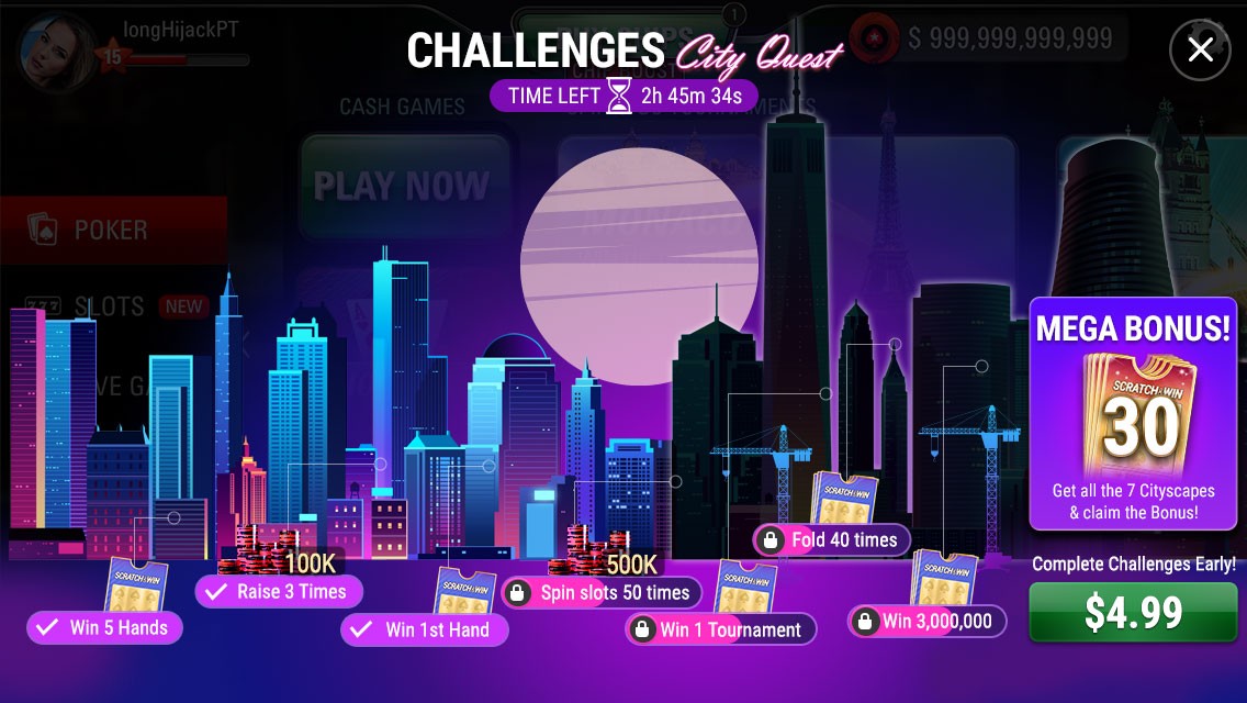
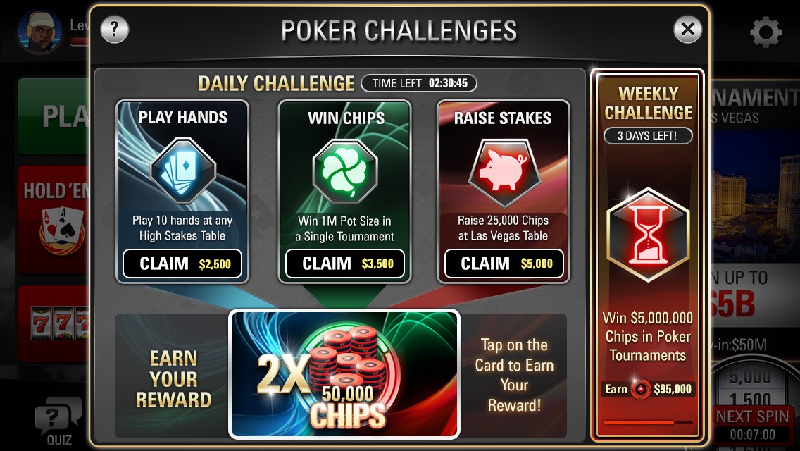
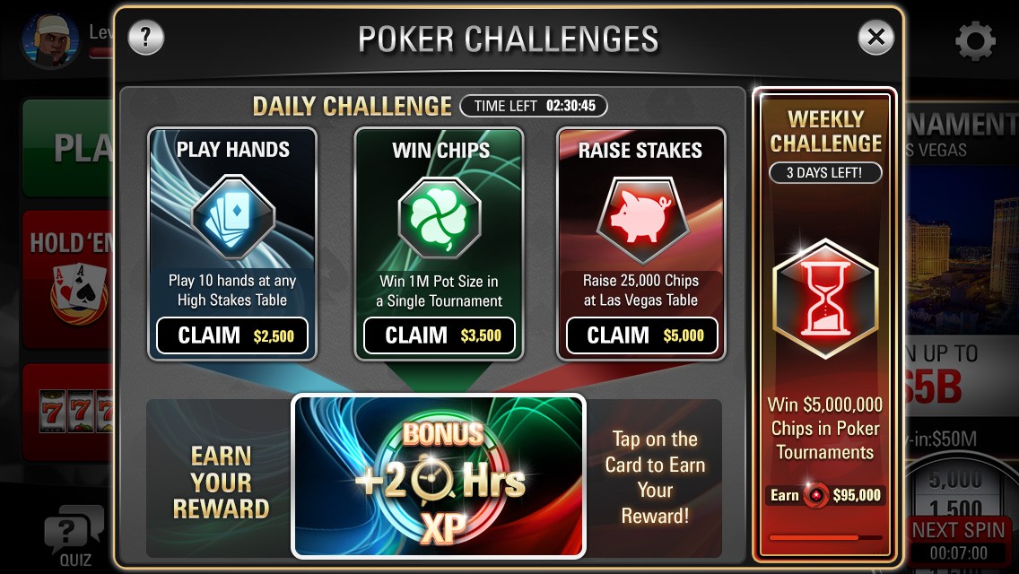
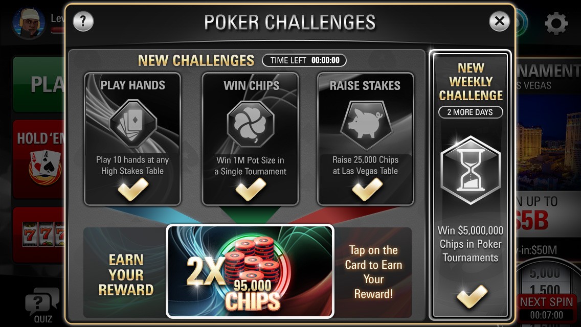
Challenges UI - Mock ups and refined art
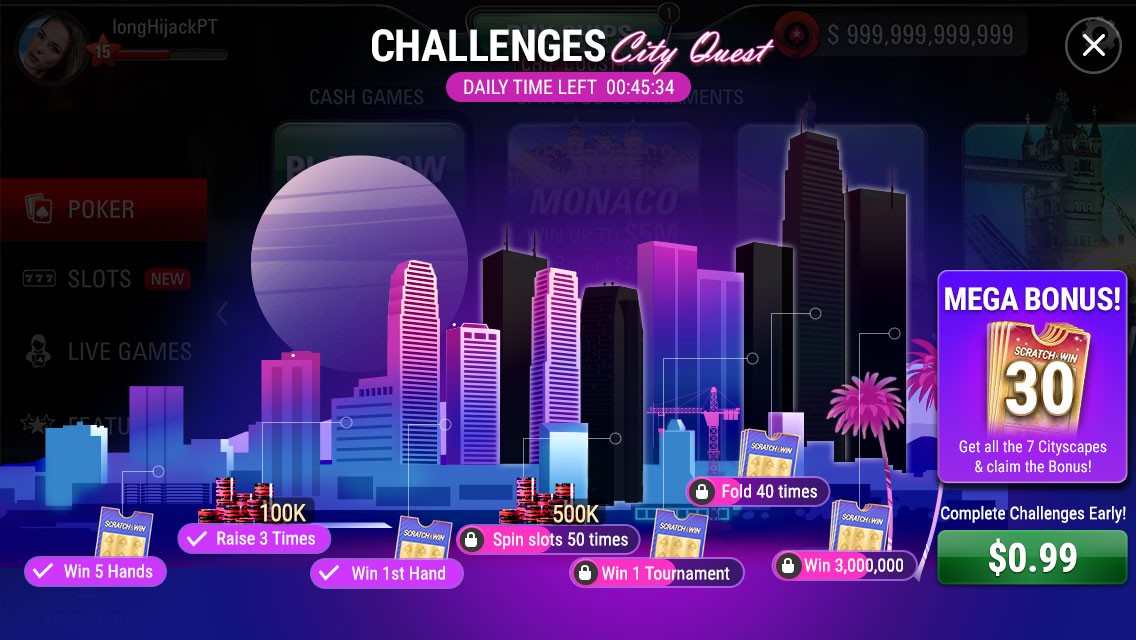
The sophisticated aesthetics of our Challenges were captivating card layouts in the dialogue UI. These cards possessed details concerning a specific challenge. The card's status would alter based on whether the task is fulfilled within the deadline.
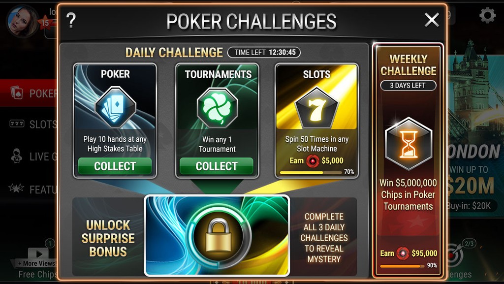
Problems identified in user review and play tests
Problems
Link between Big reward and other challenges was unclear.
Progress of each challenge was not visible properly in challenges UI.
There was no actual sense of progression towards the big reward.
Possible Solutions
Connected graphics could solve the link.
Each challenge need to show completion and marked finished with rewards earned.
Linear progression with big reward at the end could link all challenges to the end reward.
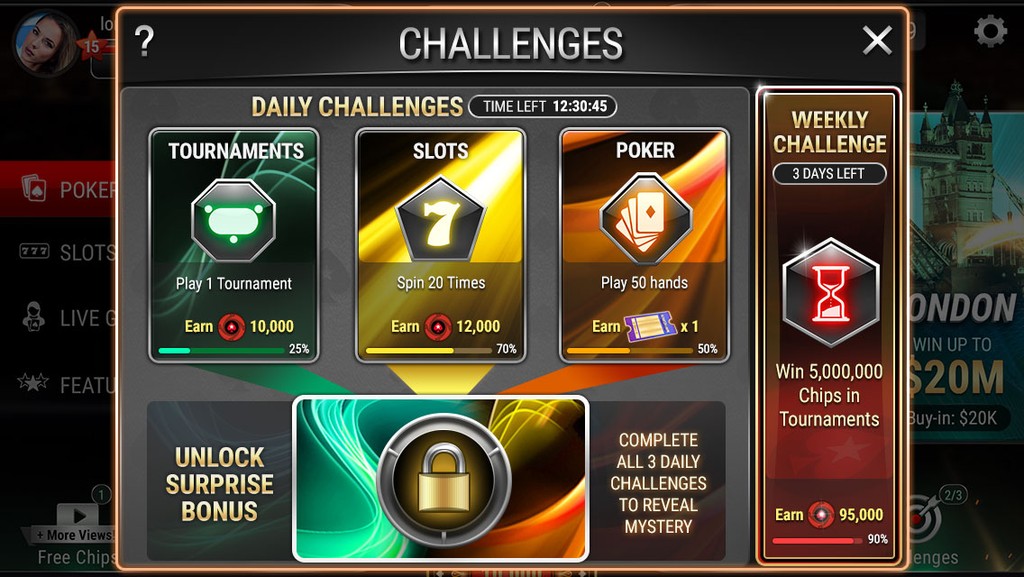
Challenges UI - redesigned based on user engagement and qualitative feedback
This challenges feature was very appealing to the eyes but users were having trouble understanding and following it in the entire gameplay. This meant that we had to come up with an entire new idea to layout the challenges UI that was clearer.
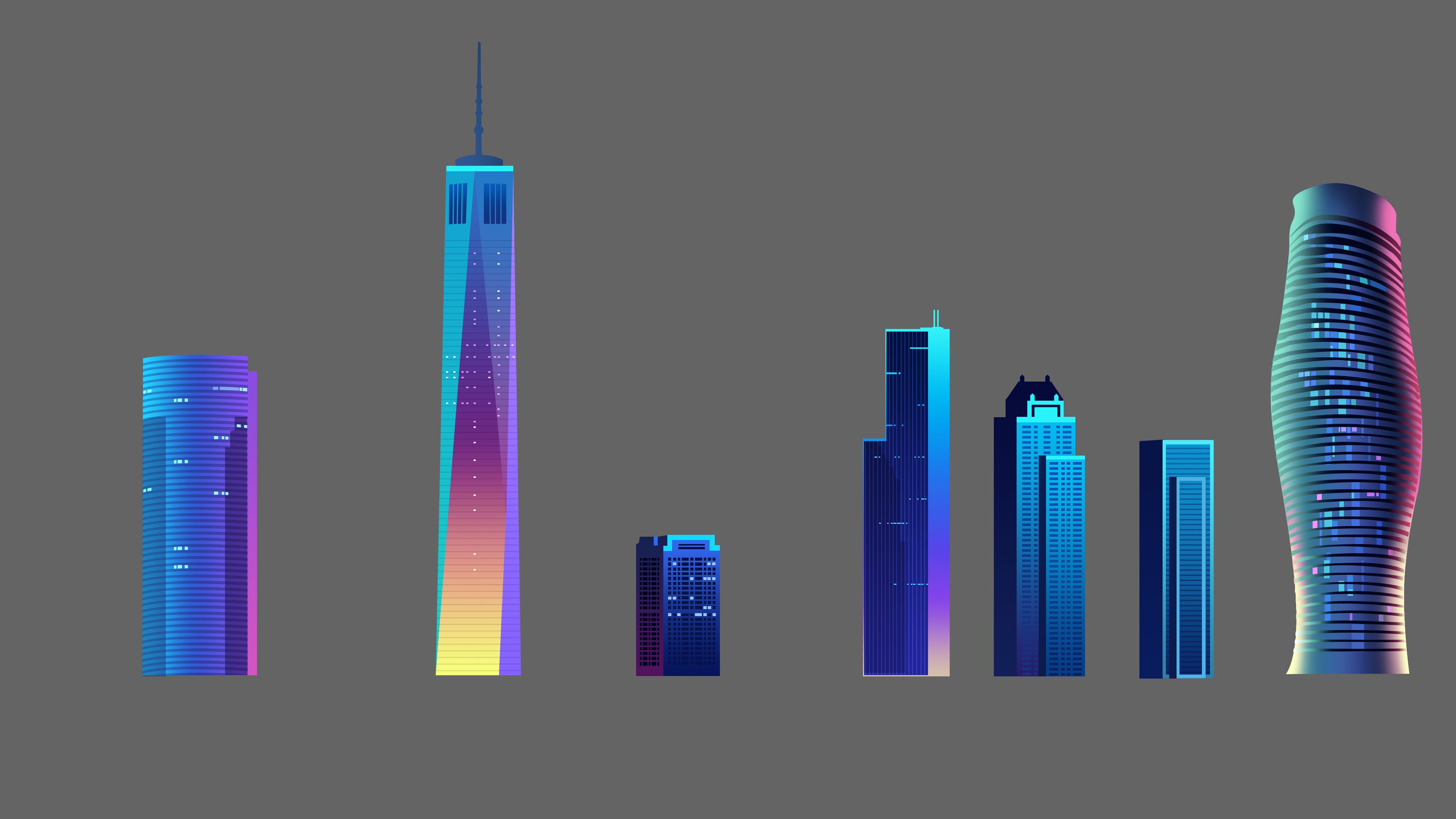

Version 1
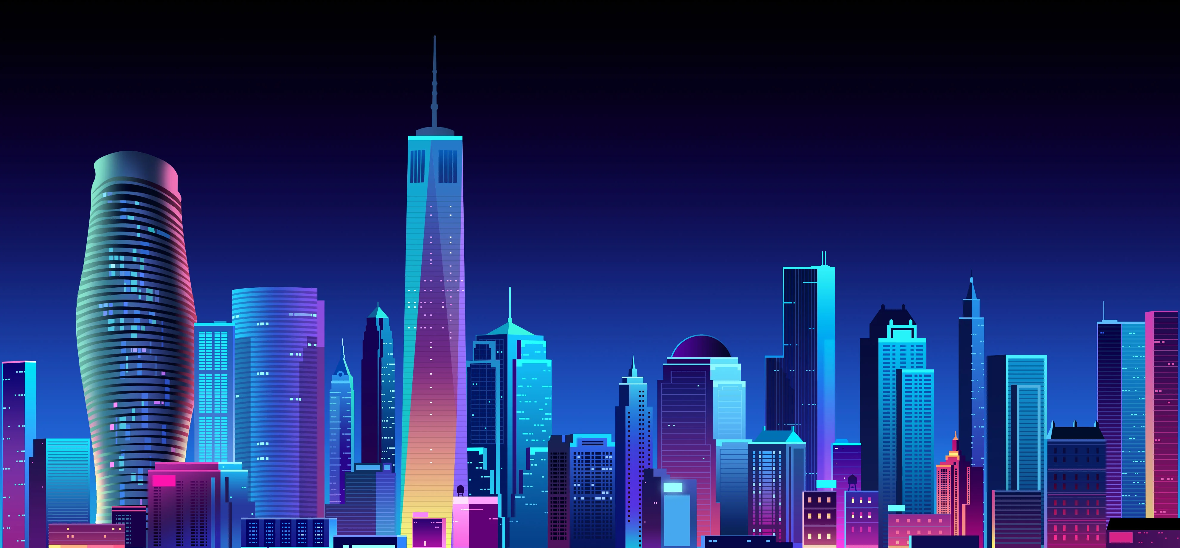
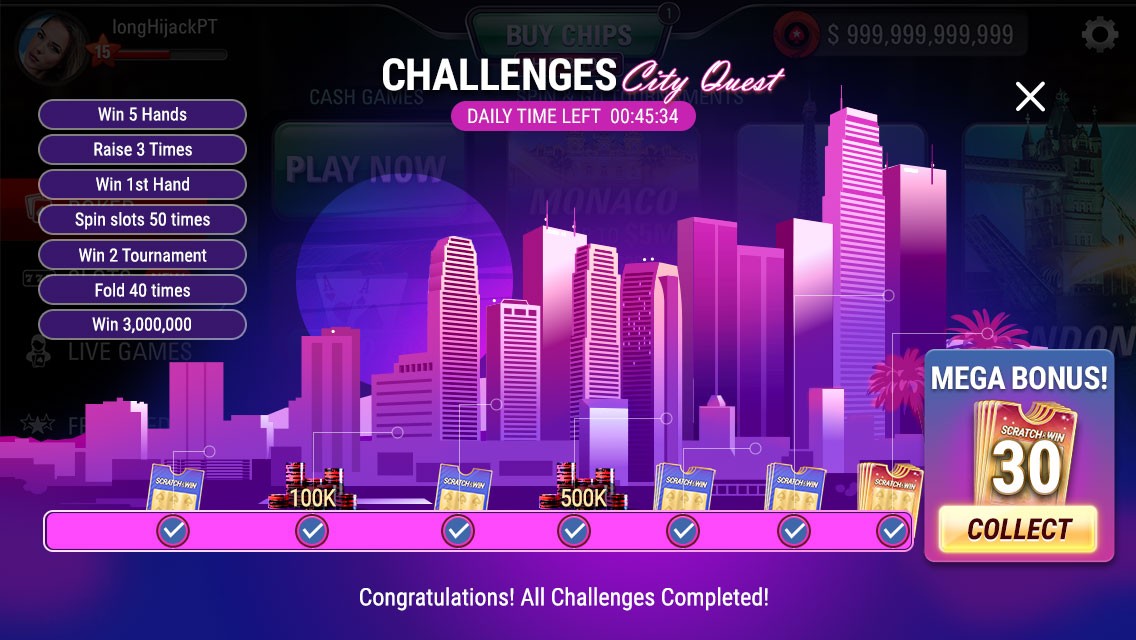
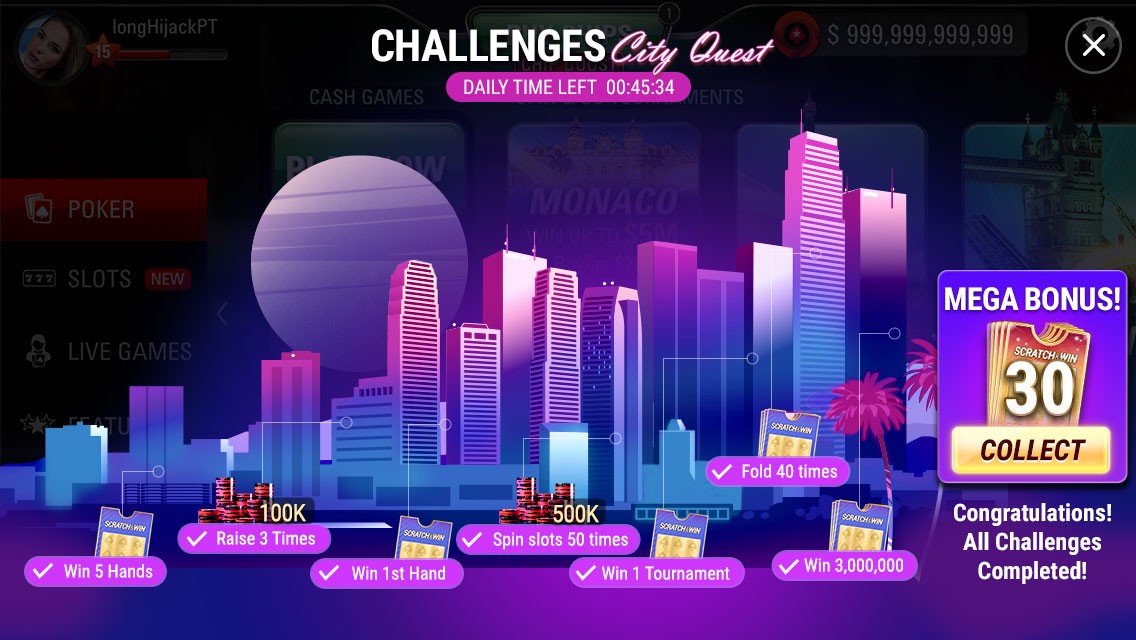
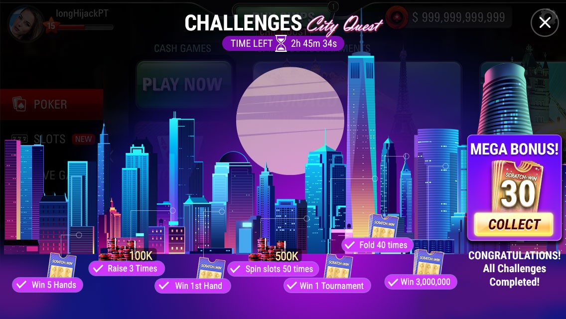
Constructed an entire urban skyline and employed a notion wherein the tasks progress along this skyline to uncover structures in that urban landscape. This below is the finalised visual design
Version 2
CTA right at the end with revelaing random uildings from the skyline.
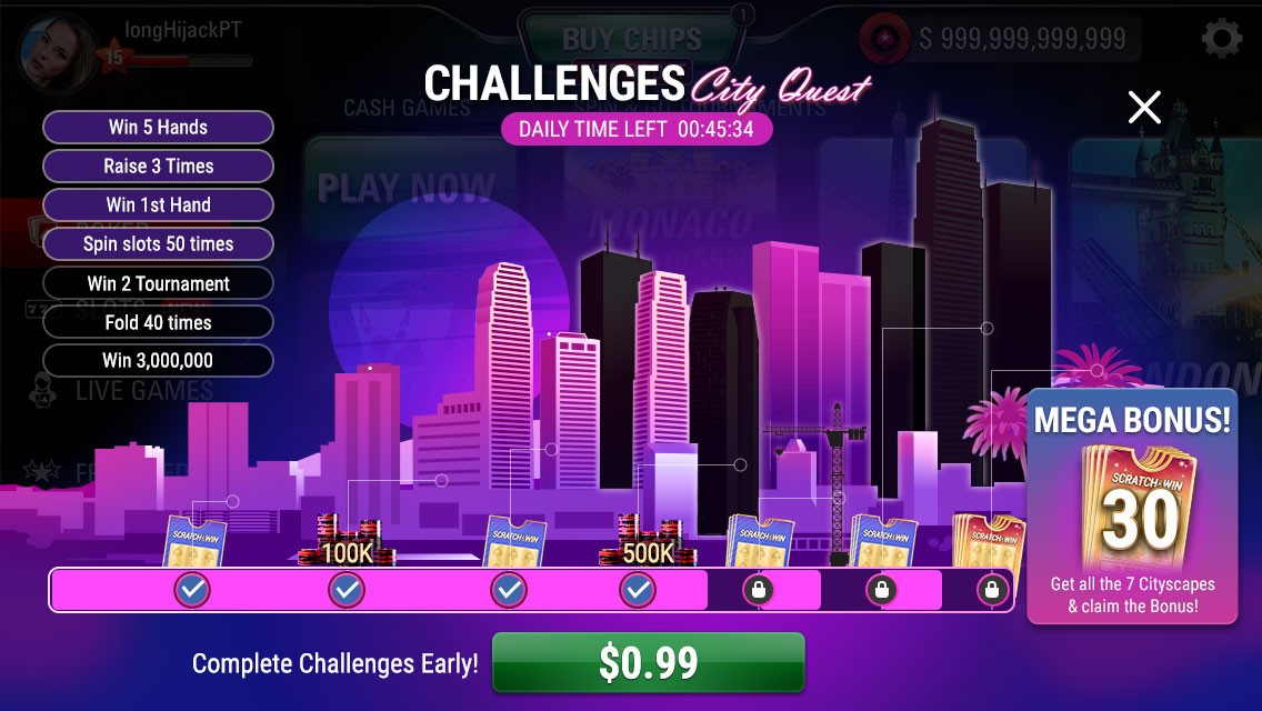
Version 3 - Final
The reveal of the buildings are more streamlined and its in a linear order in the skyline.
What have I learnt?
An exceptional user interface might not necessarily imply good usability for the users. New Features should stand out in the game graphically but not at the cost of good usability.
It's crucial to maintain clear visibility of the progress bar along with teasing the final reward.