Lobby (Landing page) Re-design
2019-20 | ISLE OF MAN
Brief
To revamp the app landing page to make it look enticing and attractive. To move away from the old fashioned tiles that we had in the game since 2014.
My Role
UI/UX (Product) Designer
I was responsible for the app's Landing page revamp and it's full development cycle, from initial concepts to final mock-ups and prototypes
Other team members:
1 Graphic Designer
1 3D Artist
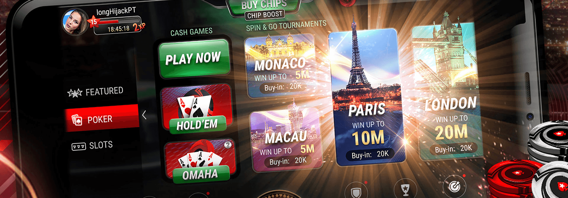
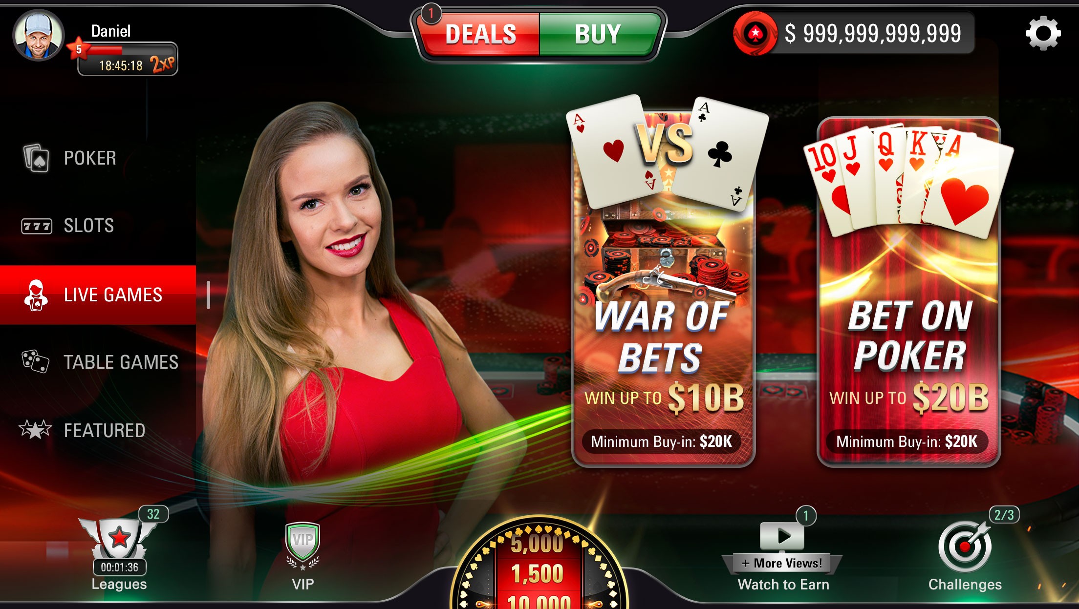
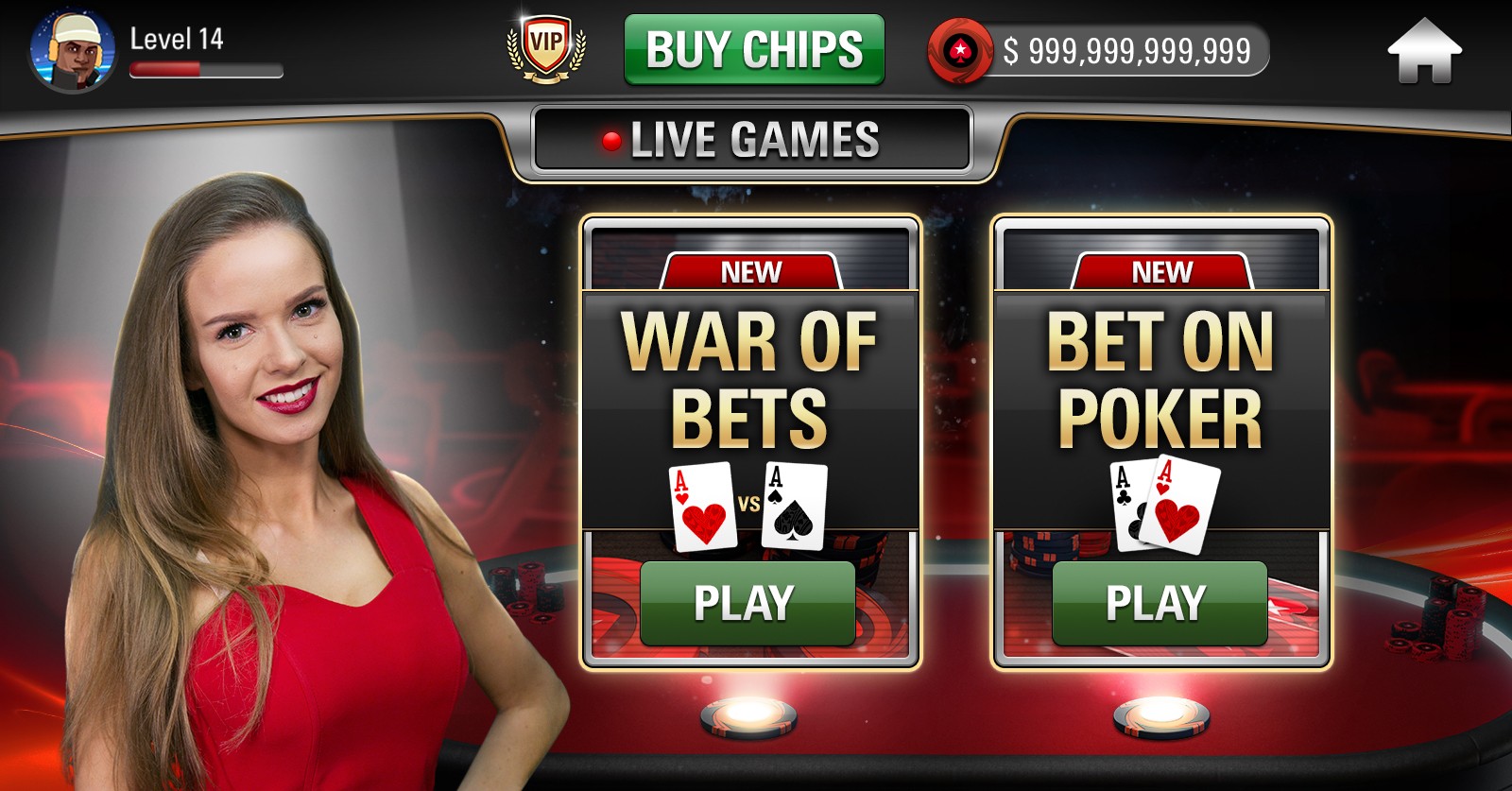
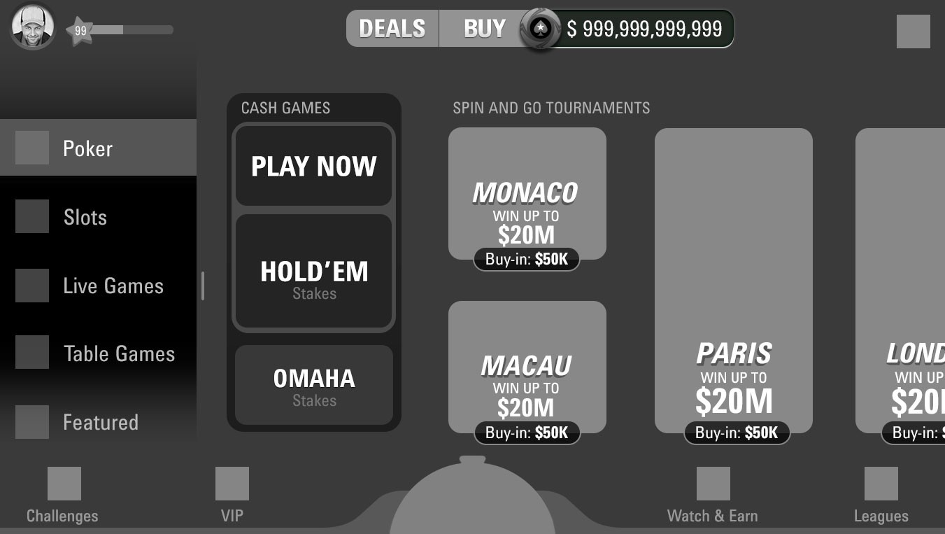
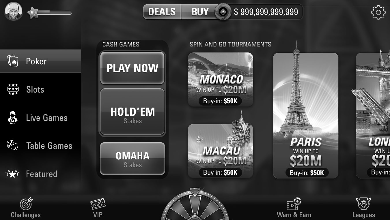
Final Designs
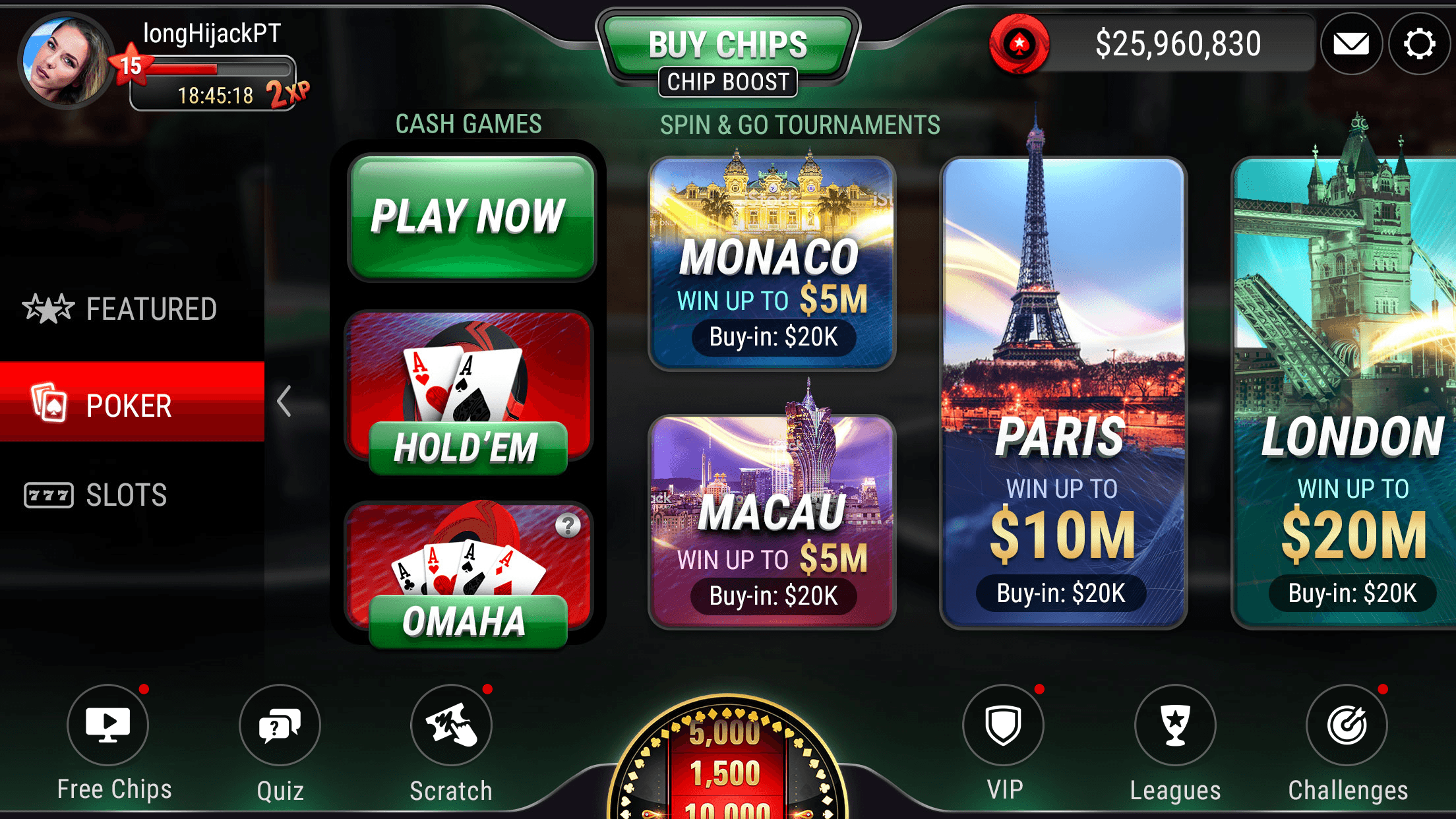
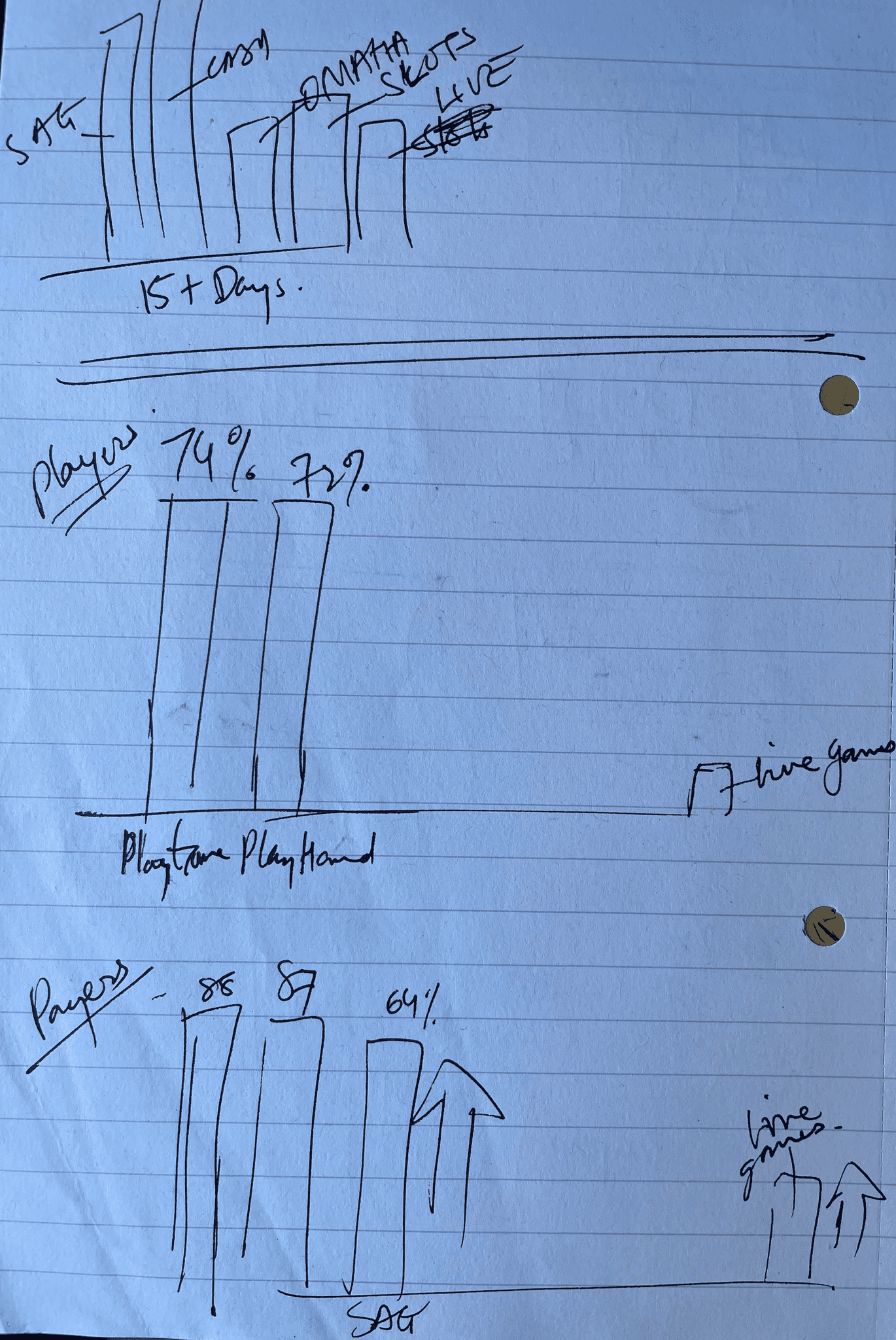
Redesigned lobby UX metrics
With increased space for new feature icons, the freshly designed lobby boosts dynamic navigation and accomplishes balance in its layout. The spin wheel stationed perfectly in the middle for easy accessibility. Players were excited to interact more with the new, sleek lobby than they did with the previous, chunky design.
Process
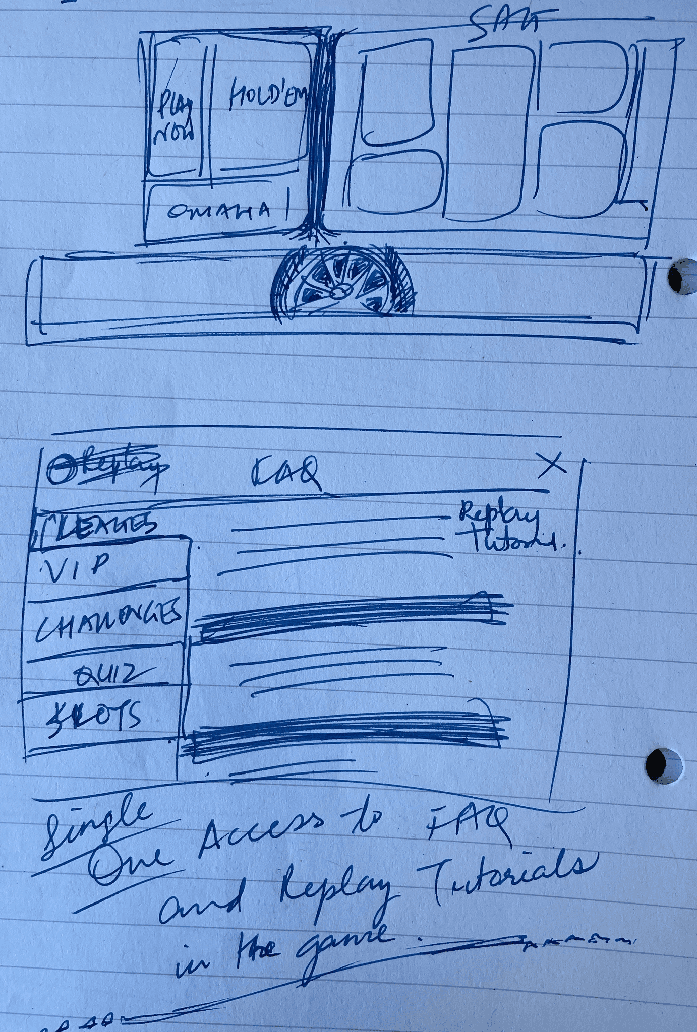
Problems in existing lobby
1
2
3
3
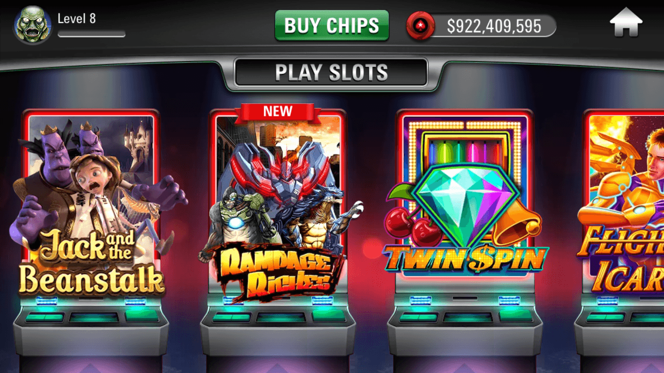
The lobby elements like Tiles were boring with no dynamic elements. The whole structure gave the page more of a static look compared to the dynamic games inside them. There was almost no space for features to grow and lobby was getting cramped for space with the icons on top (Head Up Display).

Problems
The tiles look very rigid and chunky. It was not modern like the competitors.
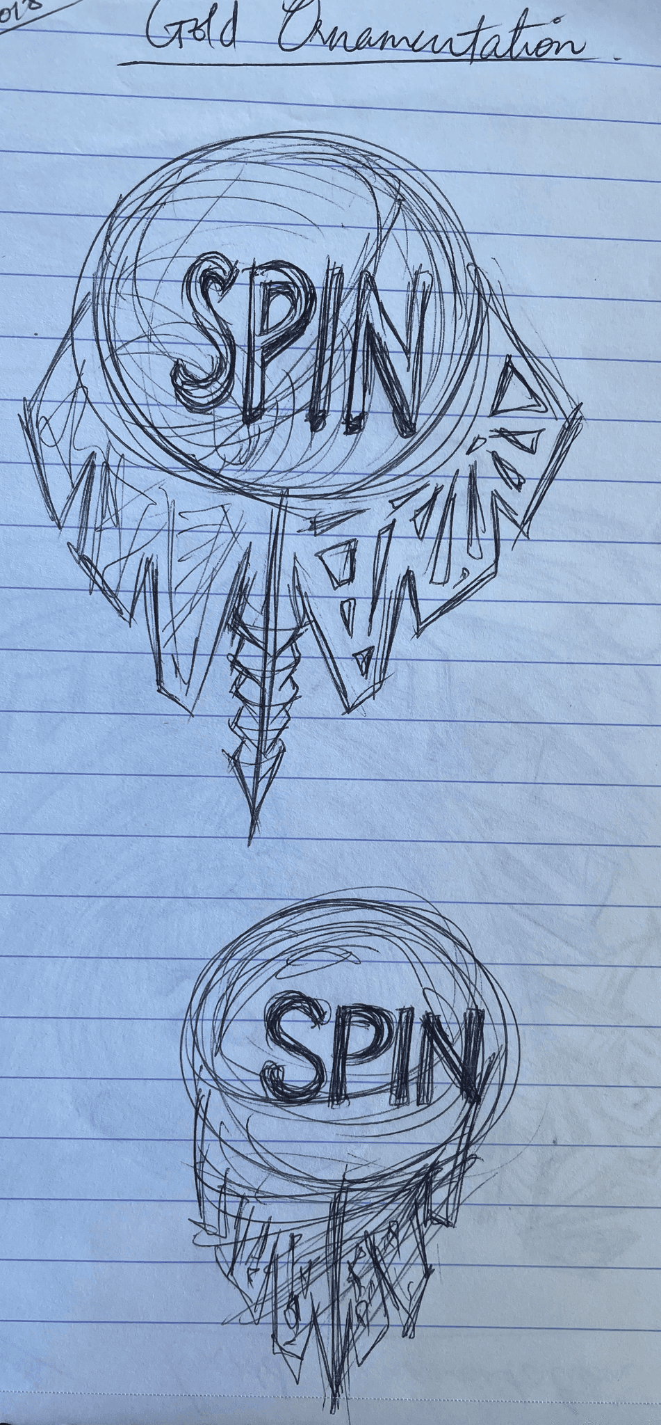
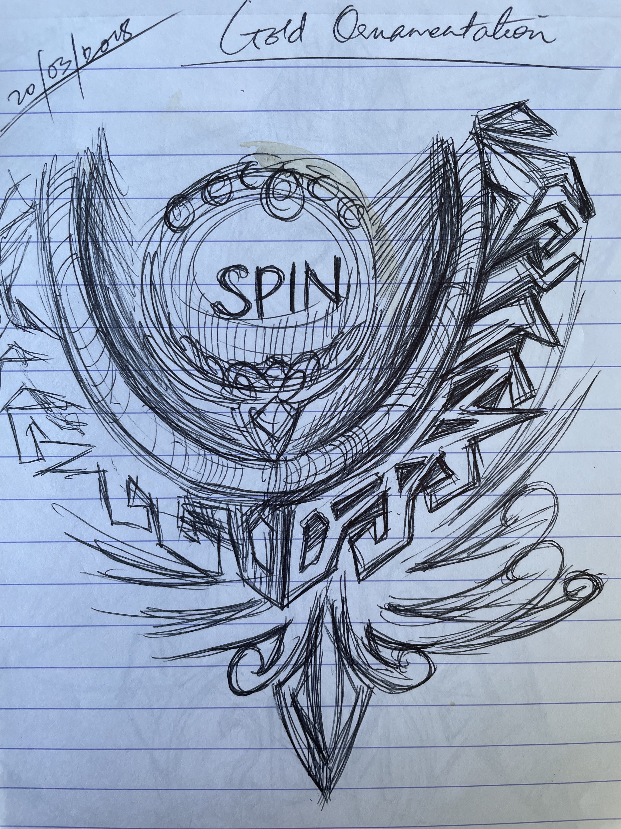
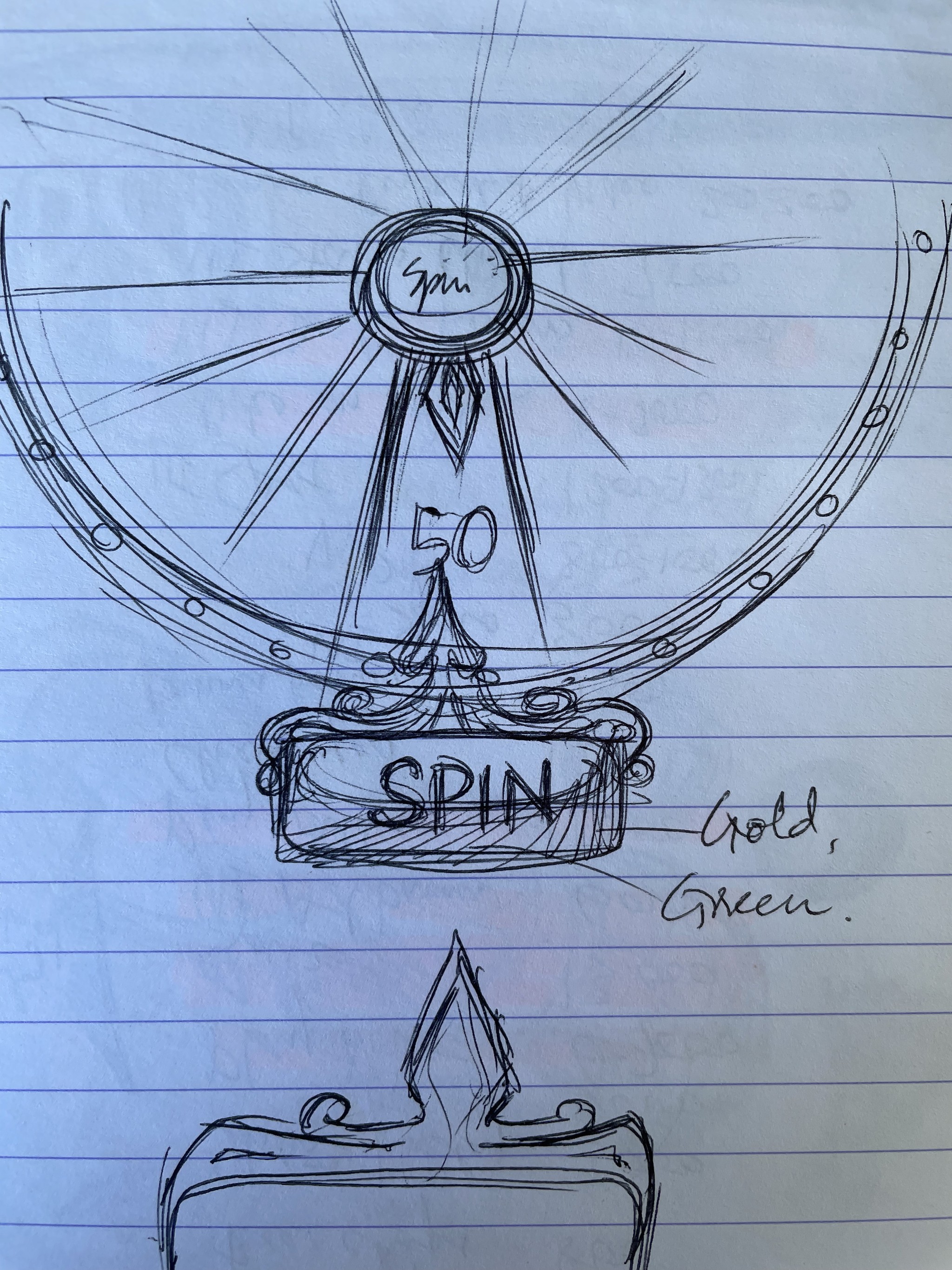
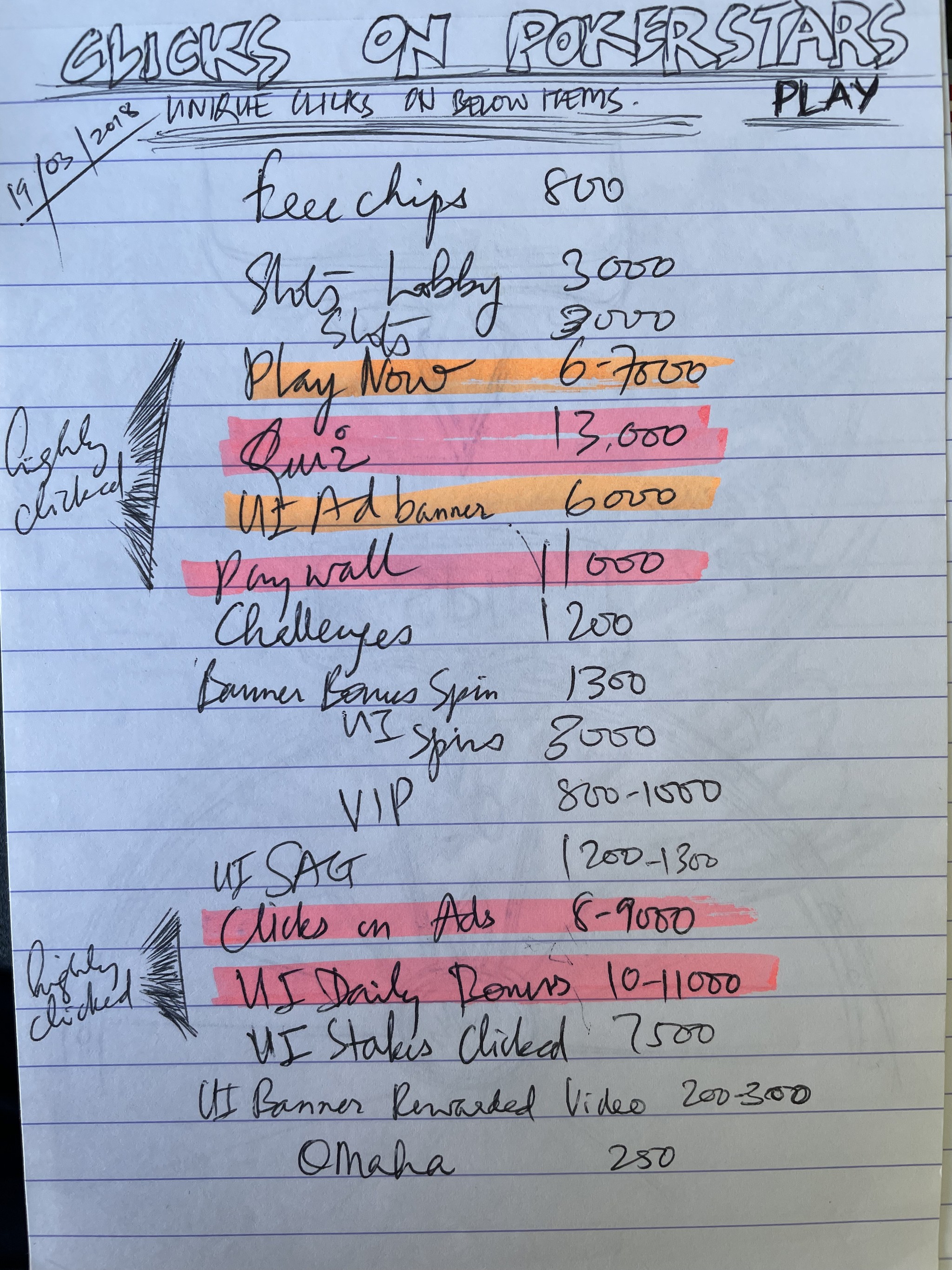
One of the most clicked element 'Spin wheel' was not given importance and pushed to the corner.
Poker and Slots lobbies did not have synergy and looked like 2 different sister apps.
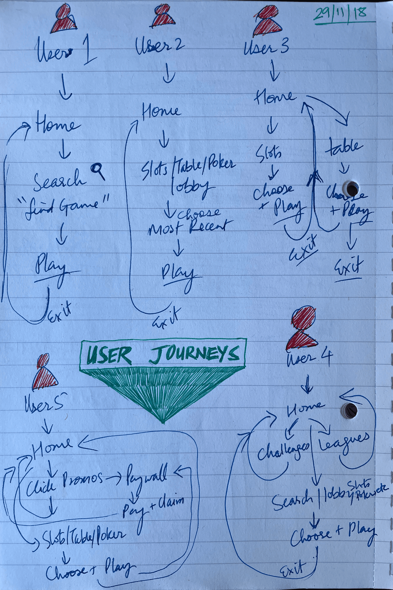
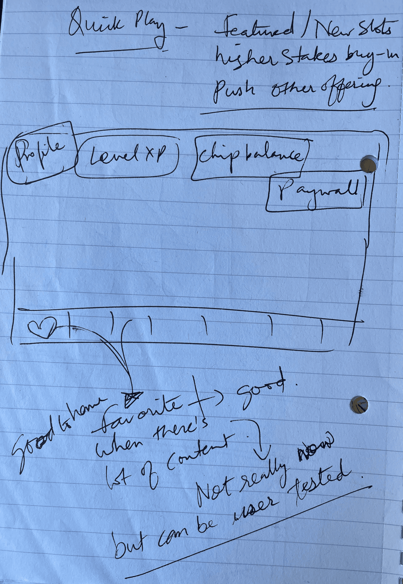
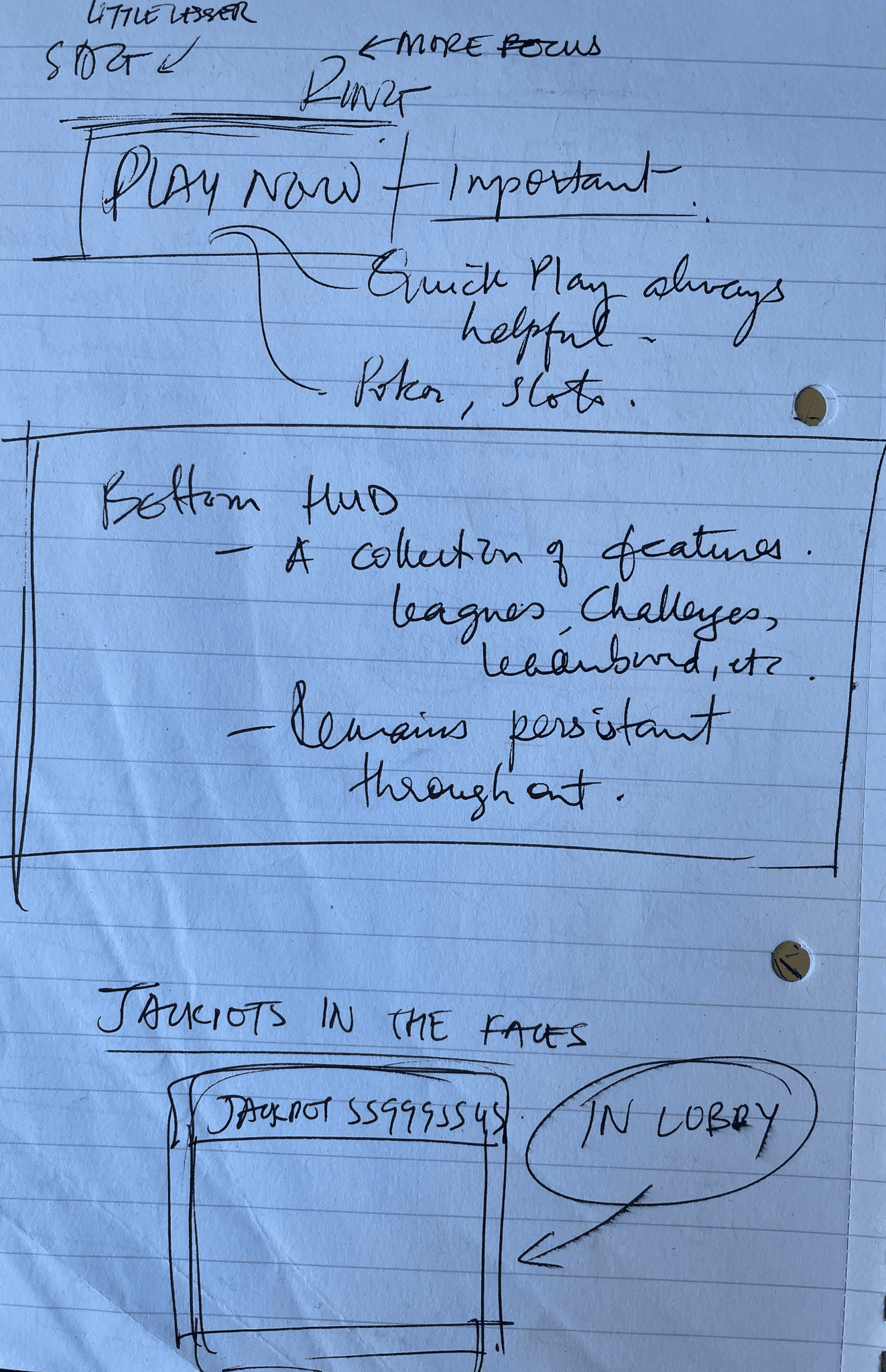
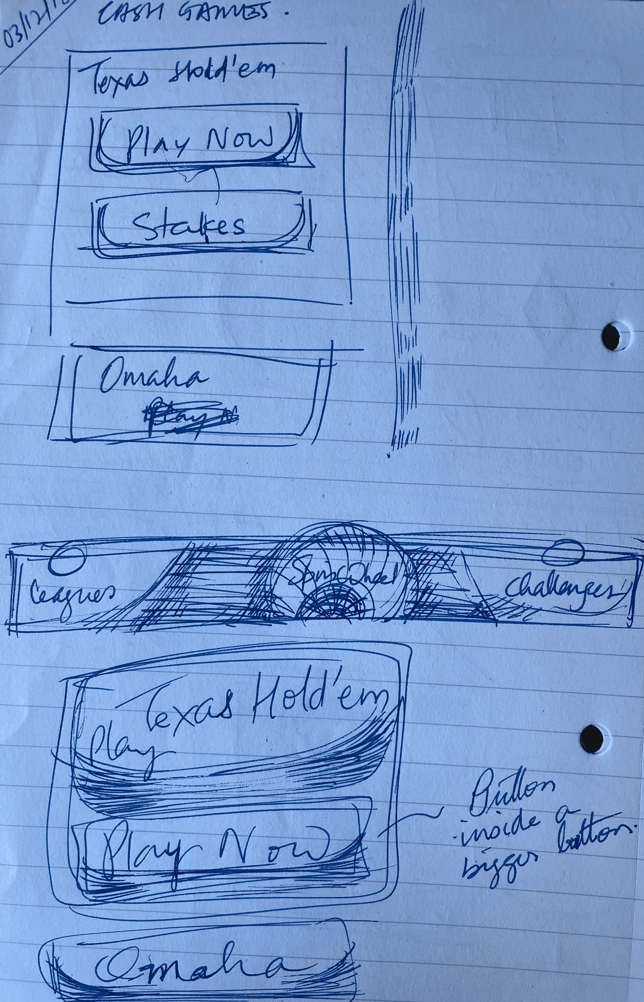
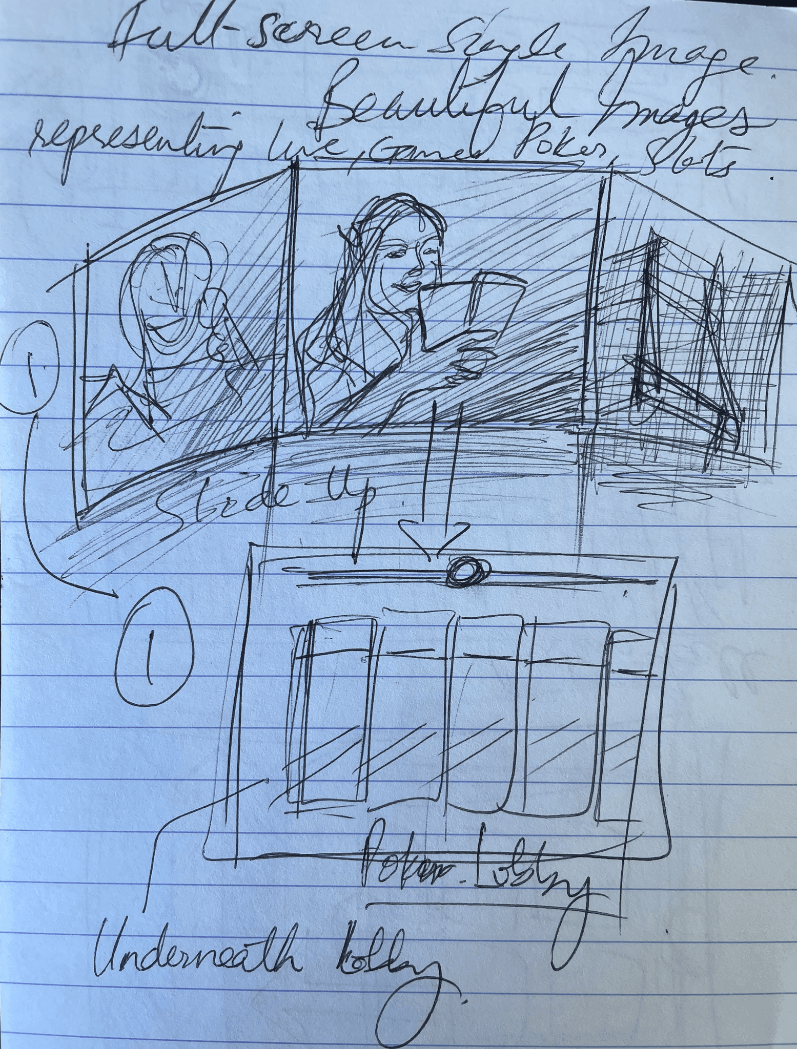
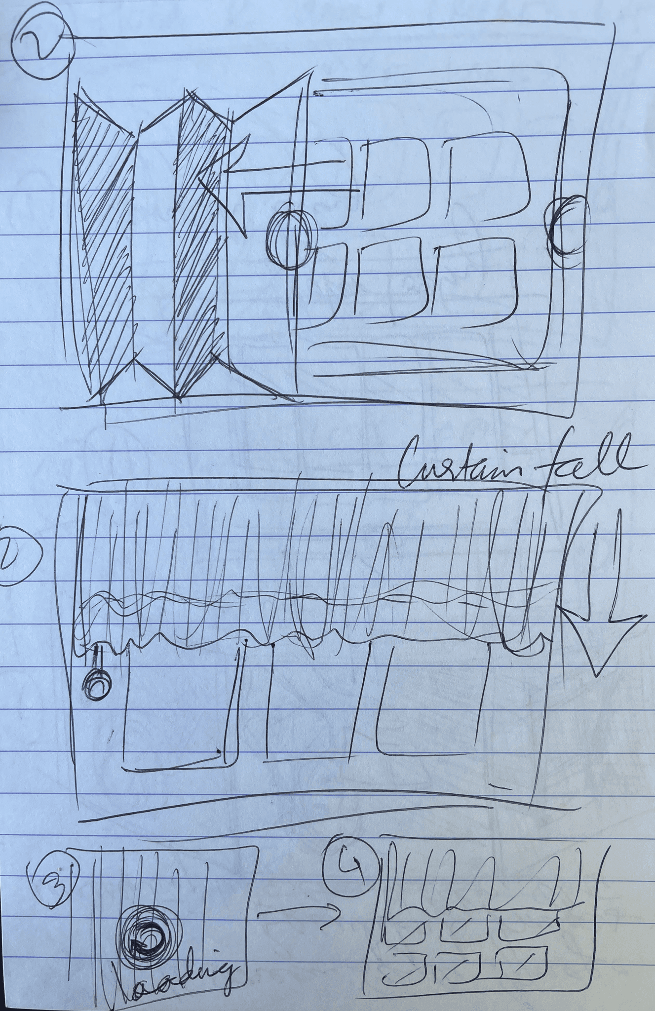
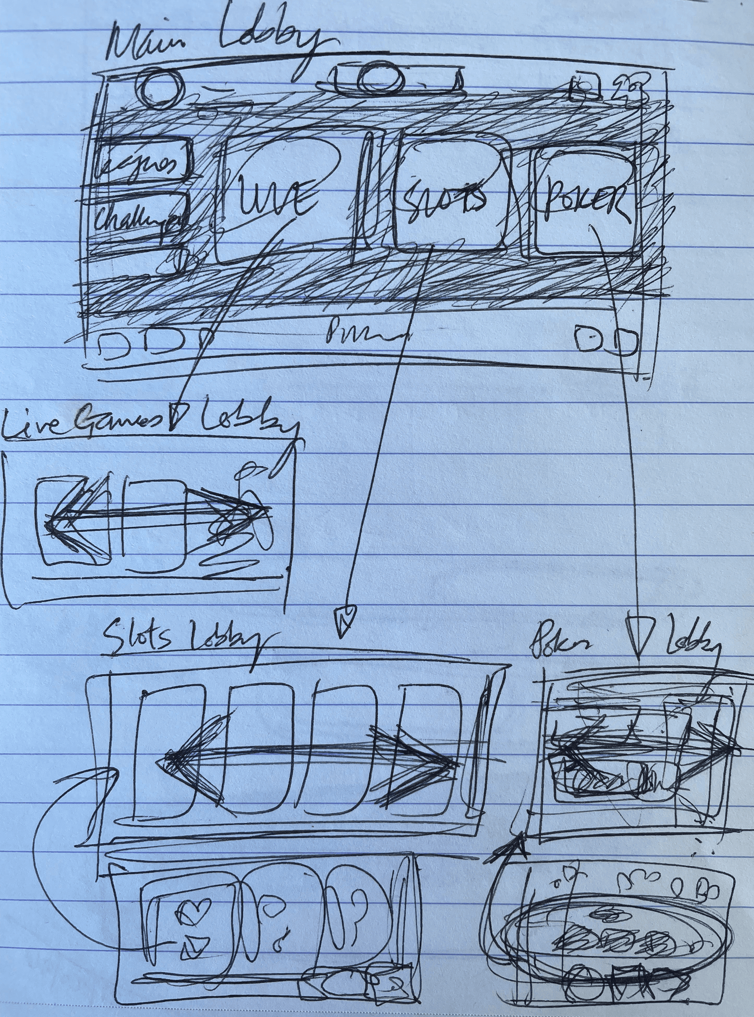
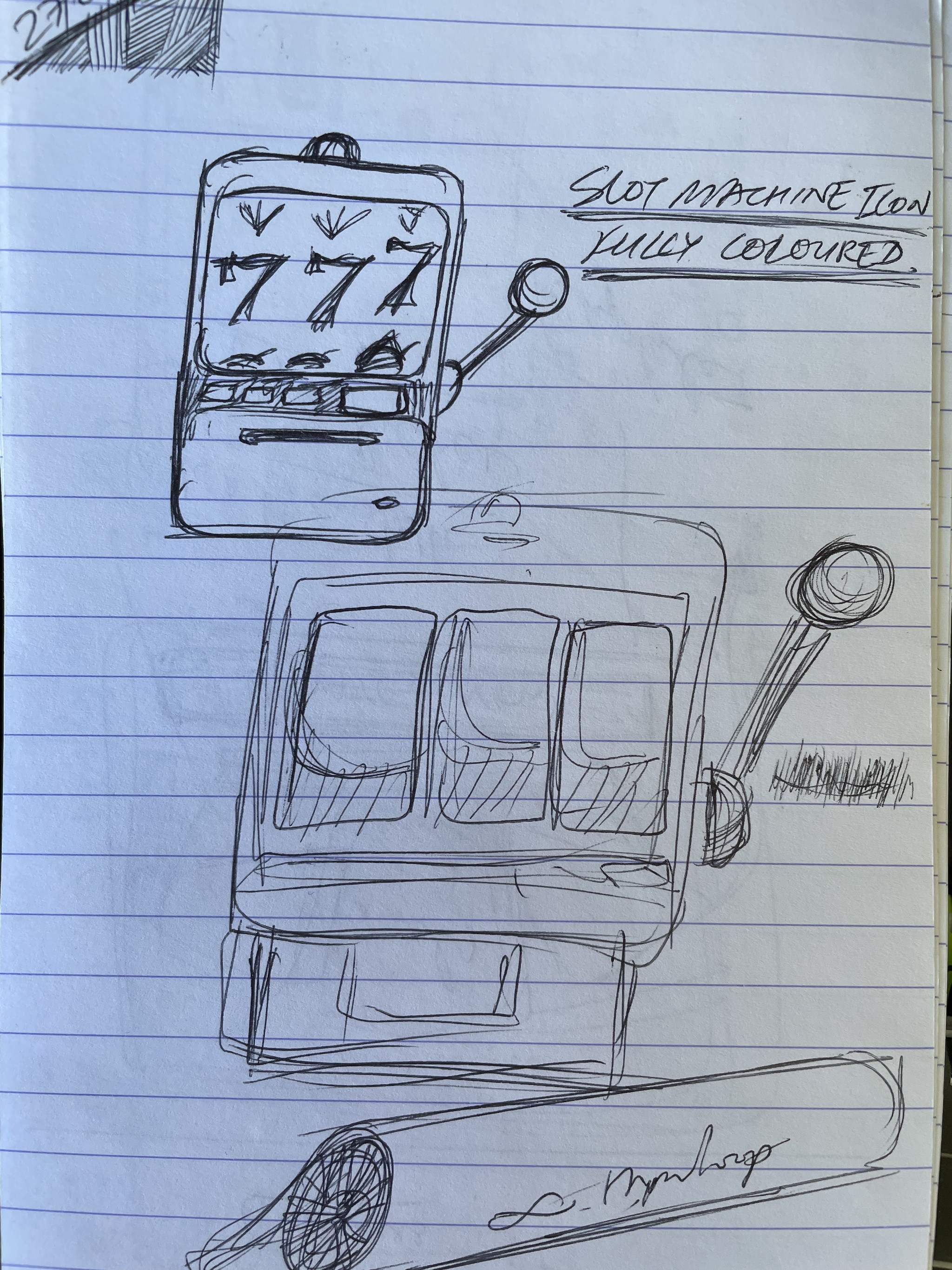
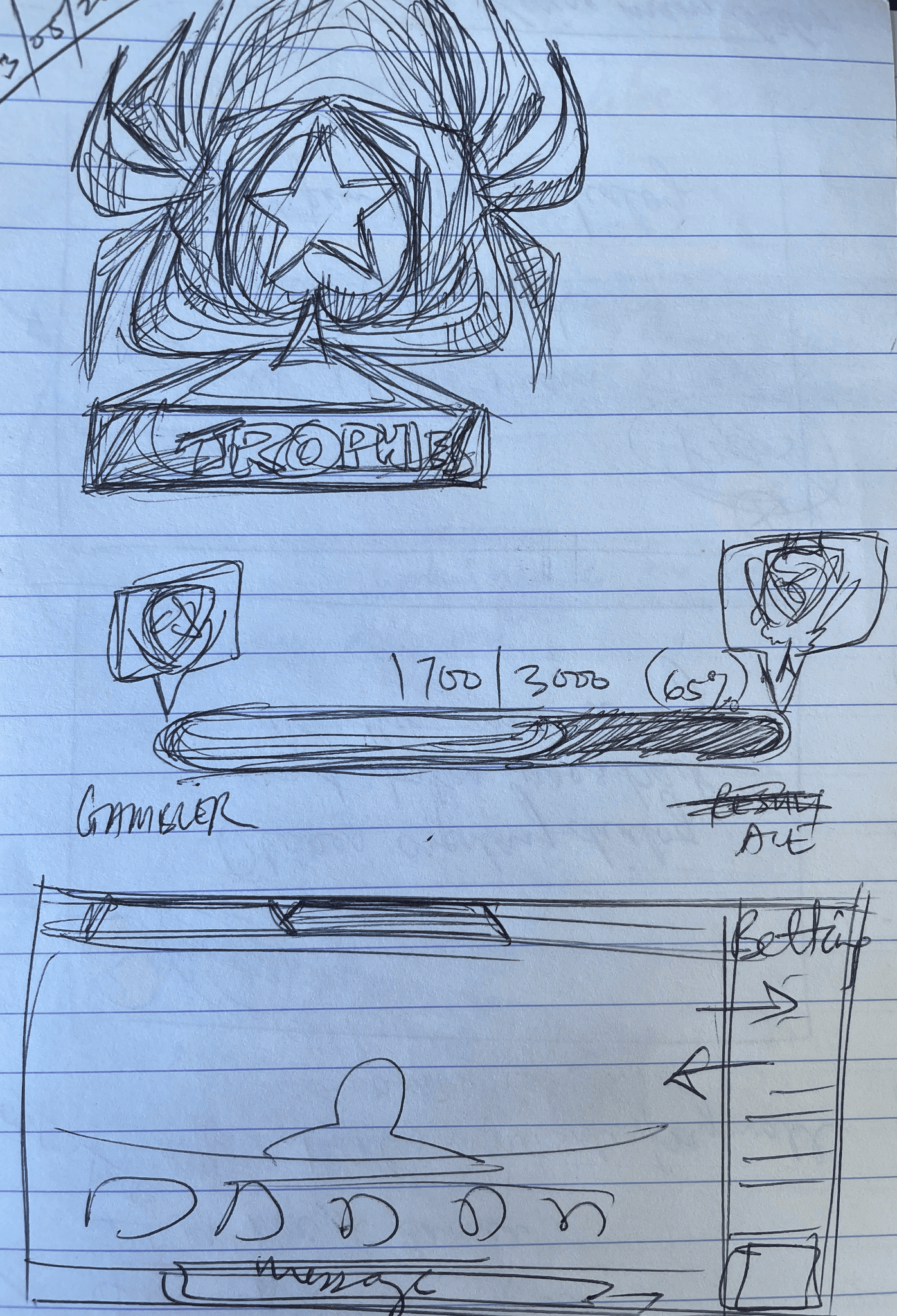
Sketches and concepts
As a new feature, Lobby redesign required some competitor analysis and review to ensure our alignment with the prevailing trends
The sketches defined the layout in concepts and took me towards the right direction in terms of what we wanted to achieve in the new lobby (landing page). There were various options of interactions examined.
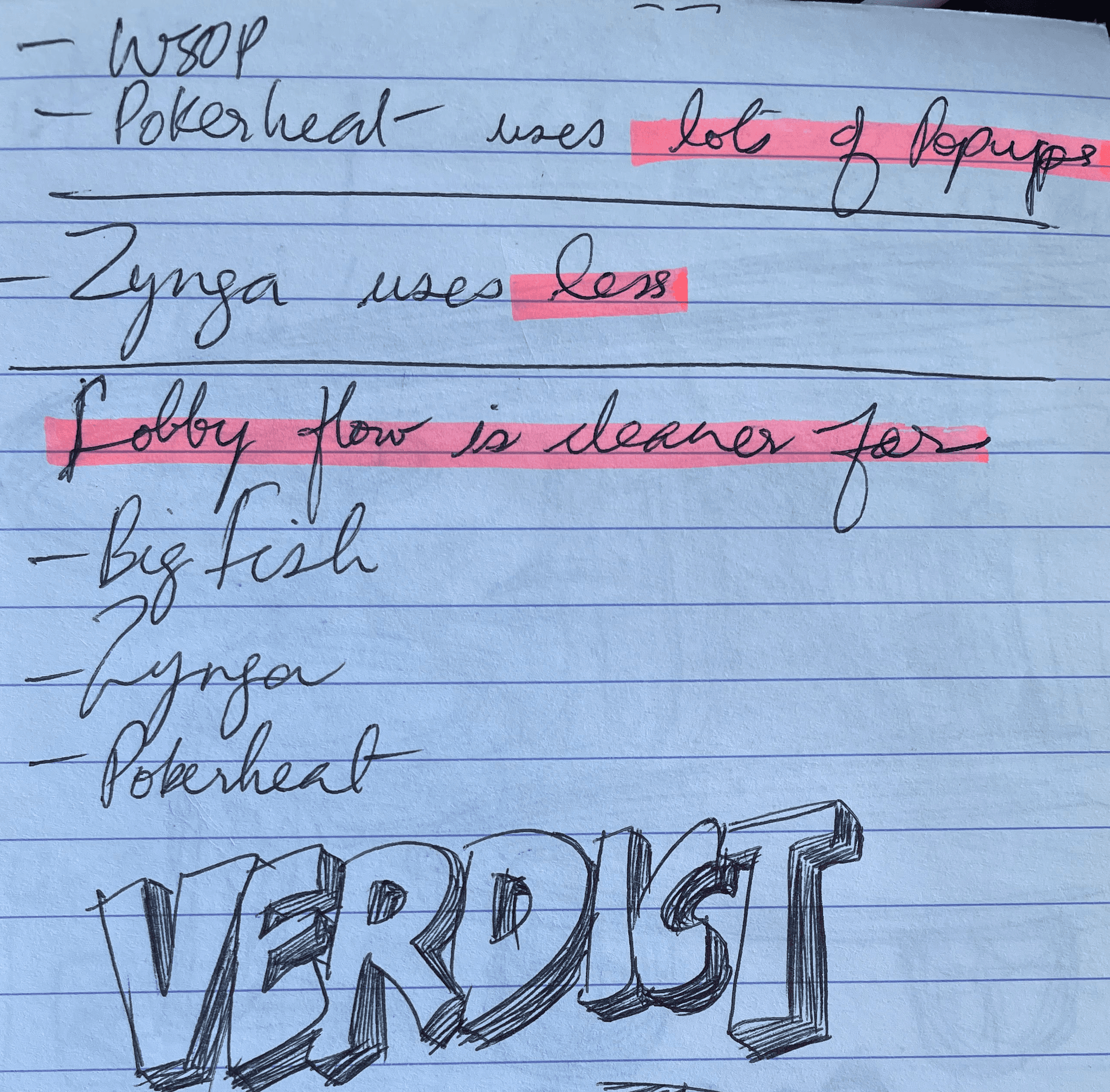
Market analysis
As a new feature, Lobby redesign required some competitor analysis and review to ensure our alignment with the prevailing trends
Competitor Analysis Takeaways
Their landing page had distinct game tiles effects and shape to grab attention. Their tiles have graphics dominating and not text unlike ours.
Their designs are scalable and have lot of space to include addition features.
They had expanding backgrounds that fill the screen for new devices (iPhone X and later).
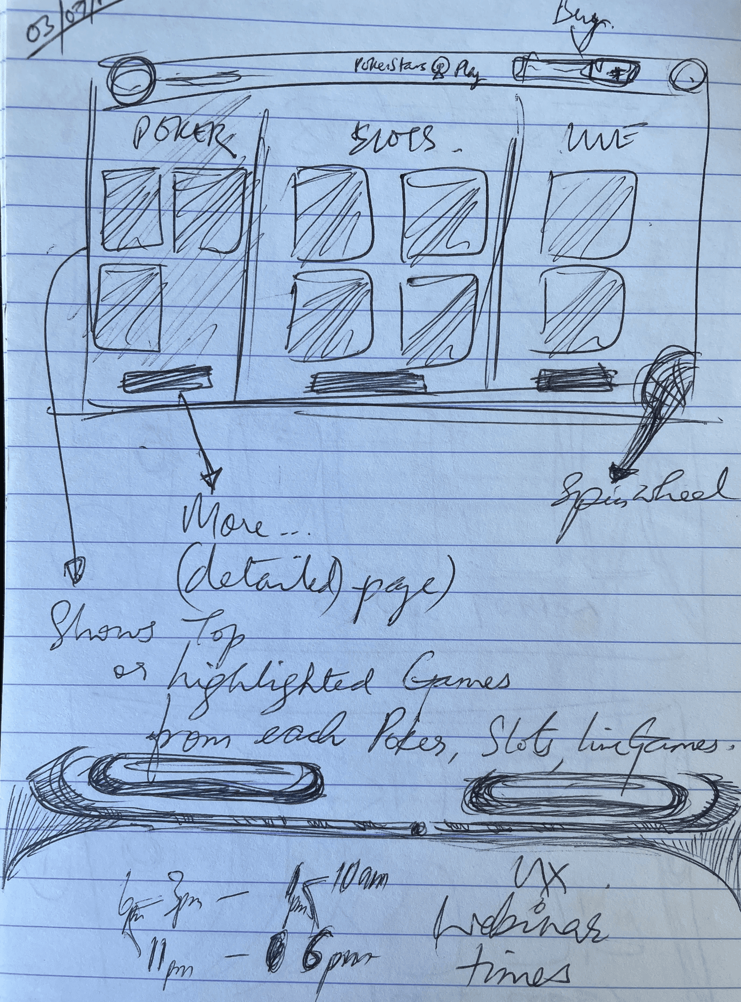
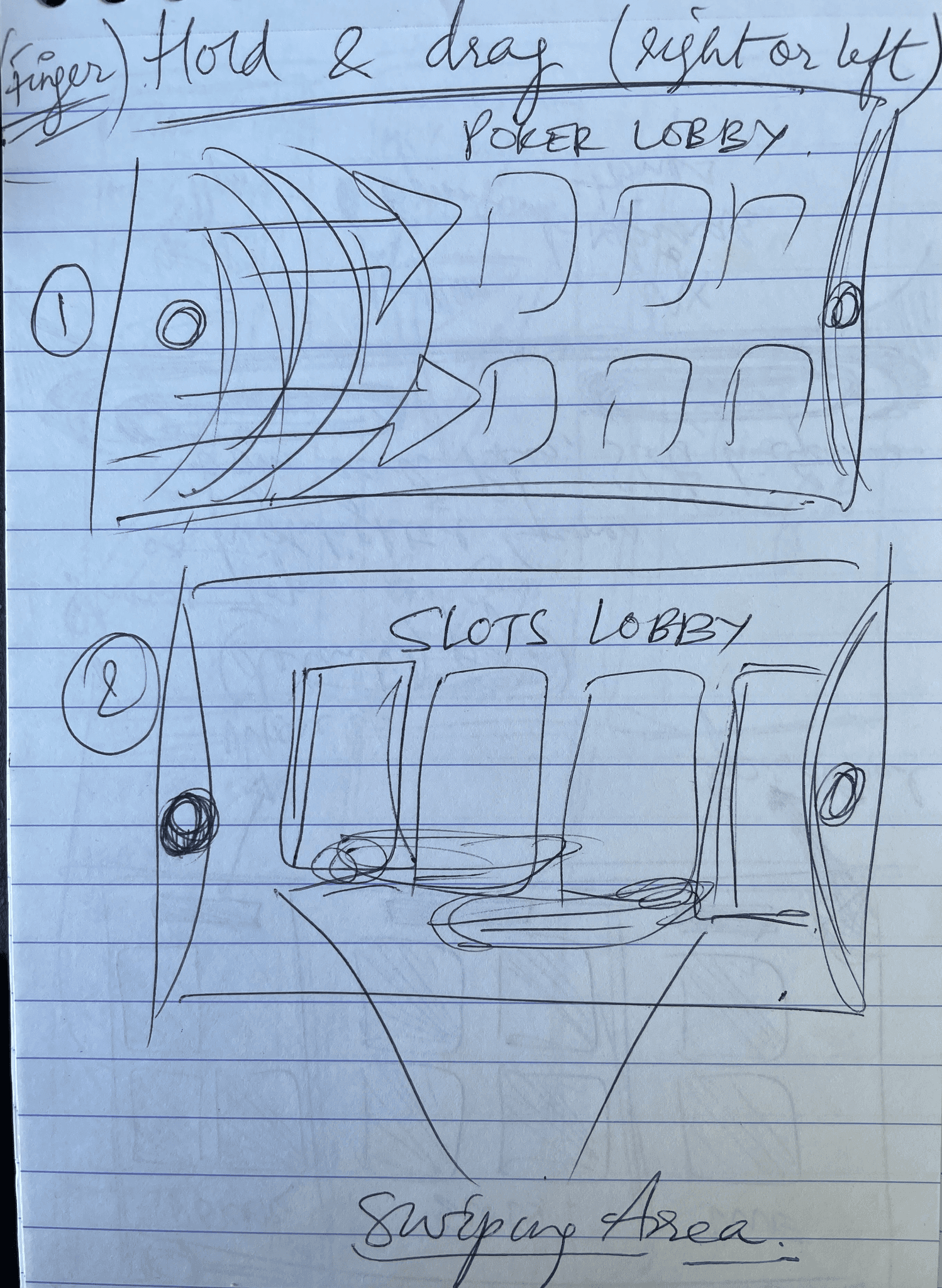
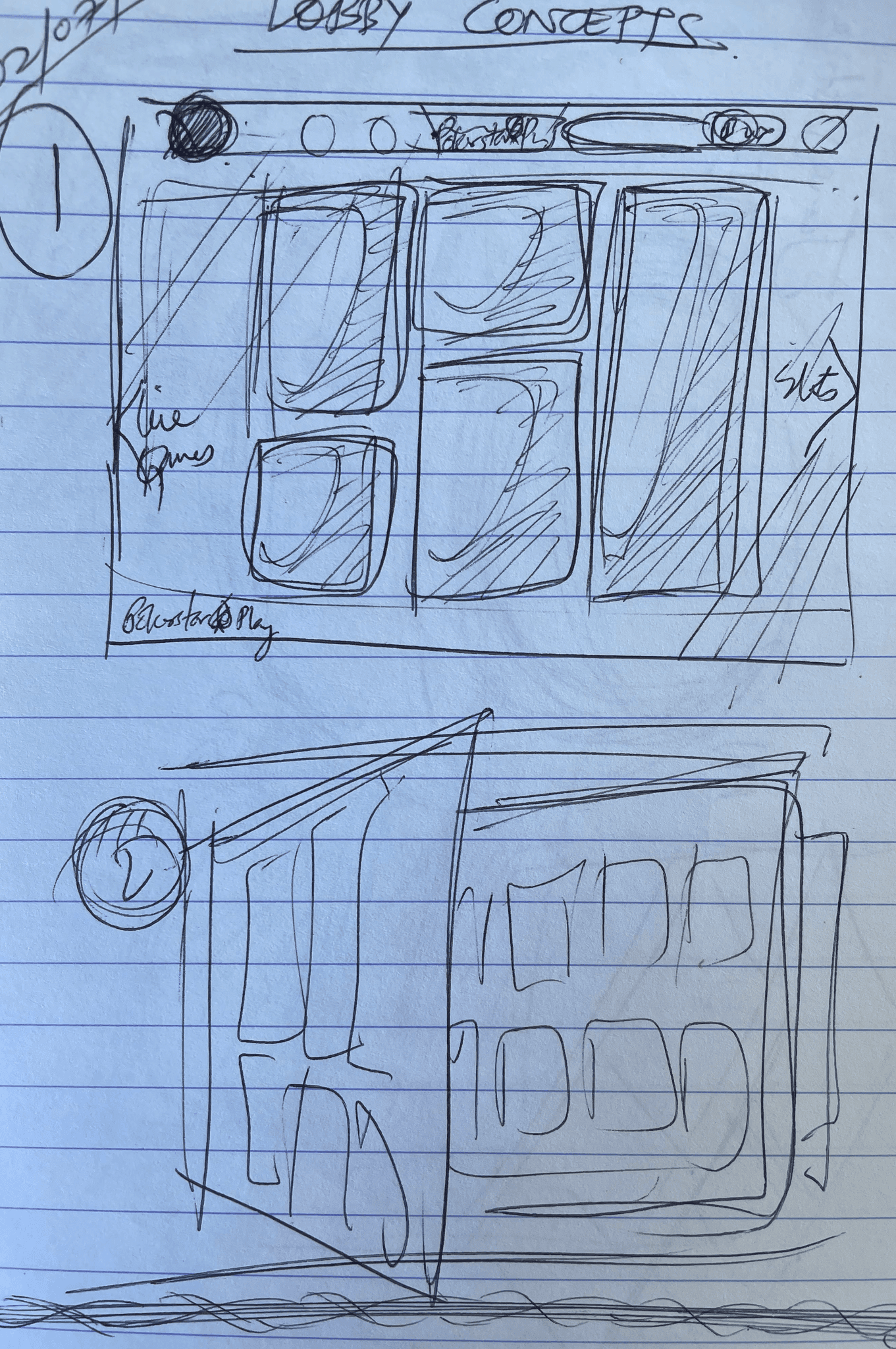
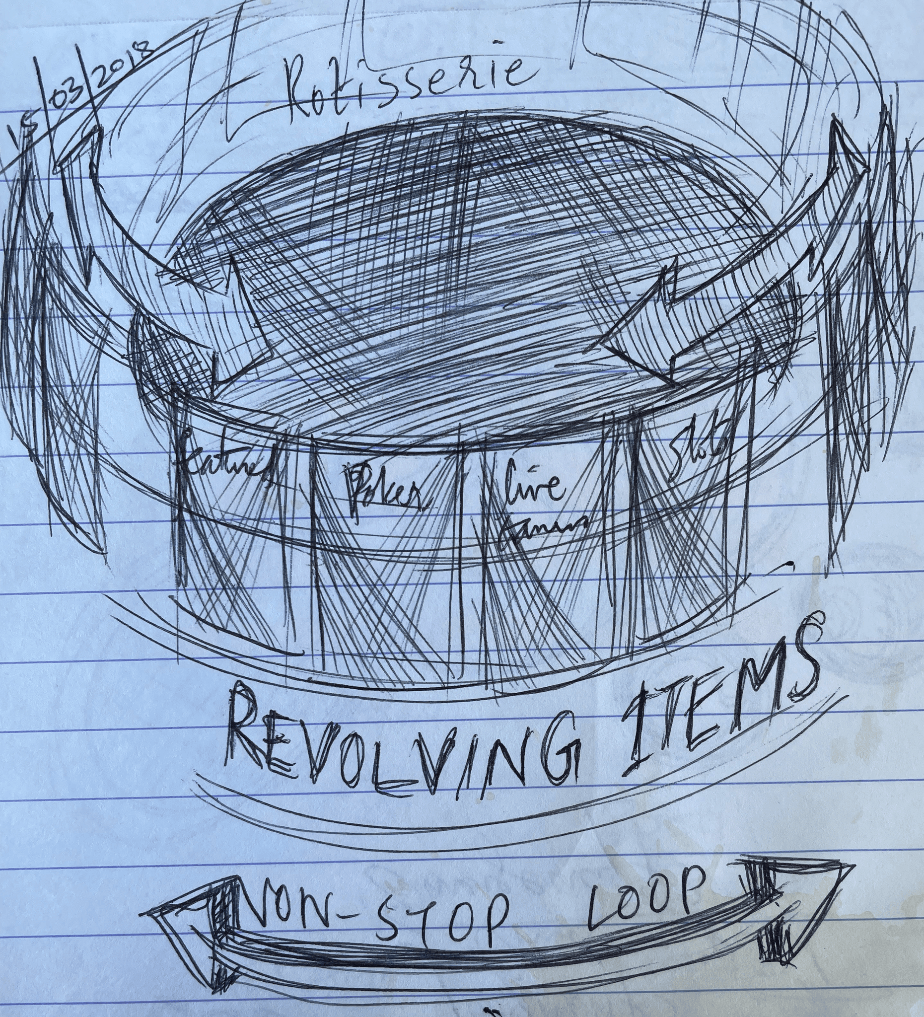
New lobby solutions using wireframes and animations
The revamped lobby had to present a renewed appearance compared to the existing one, yet it had to allow a smooth transition for both existing and new players.
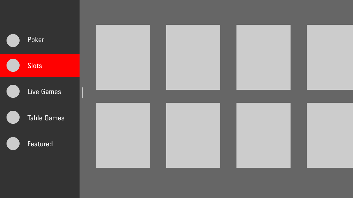


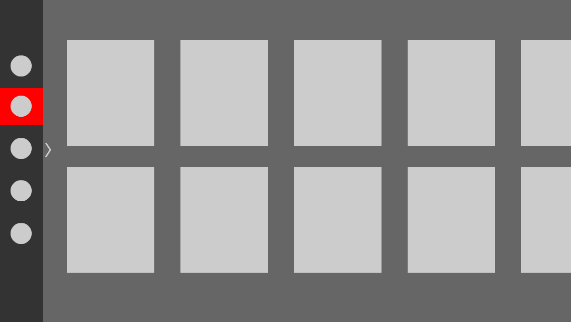
My Solutions
Dynamic tiles with more emphasis on graphics and less emphasis on the text. Light swoosh animations on the tiles to make them feel lively.
Spin wheel is put front and centre.
Consistent Lobby design UI layout for Poker and Slots.
Lobby UI - Mock ups and refined art
The refined lobby defined the palette and structure relating to the previous greyscale, thus offering a more distinct portrayal of the components on the screen.
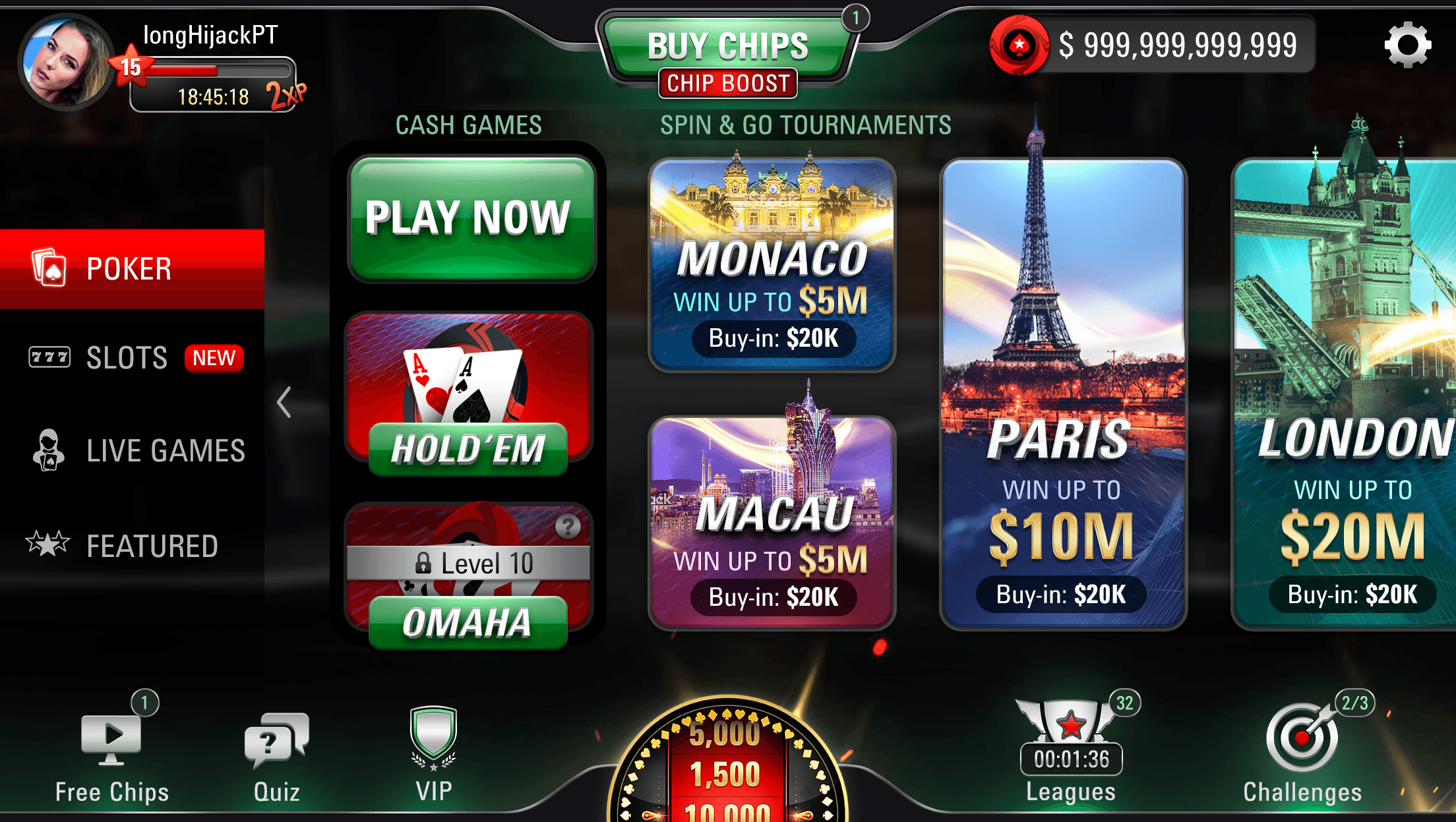
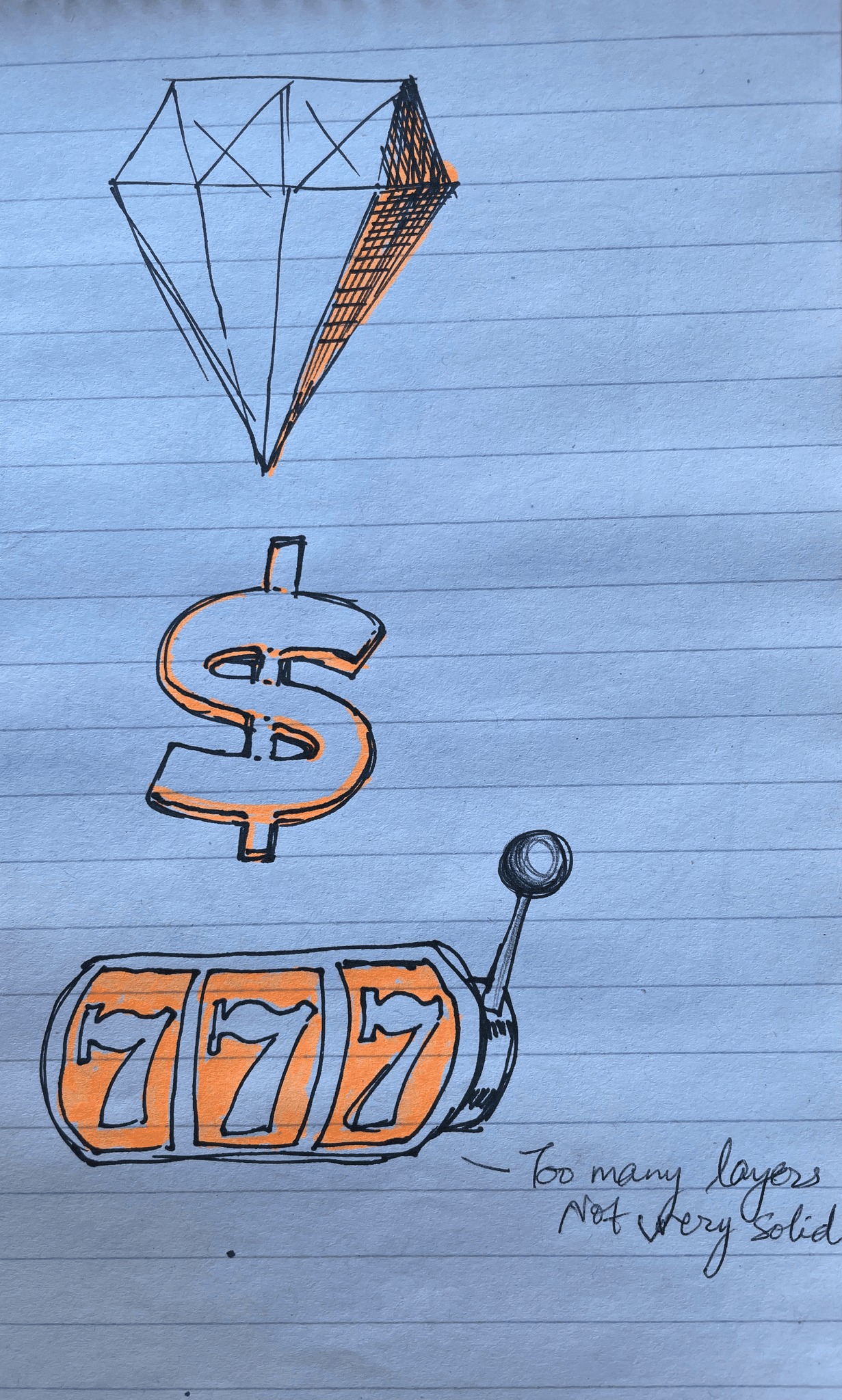
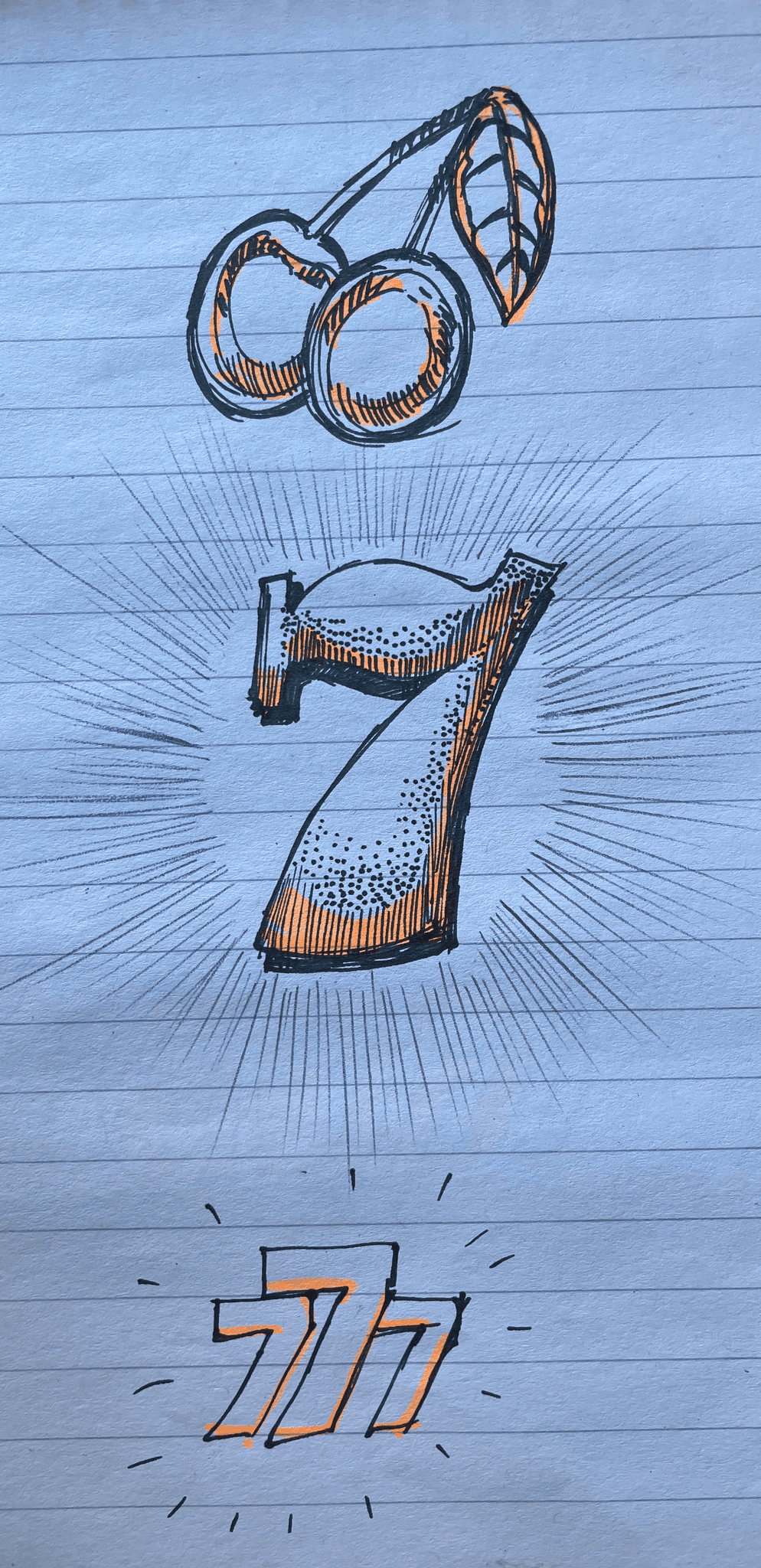
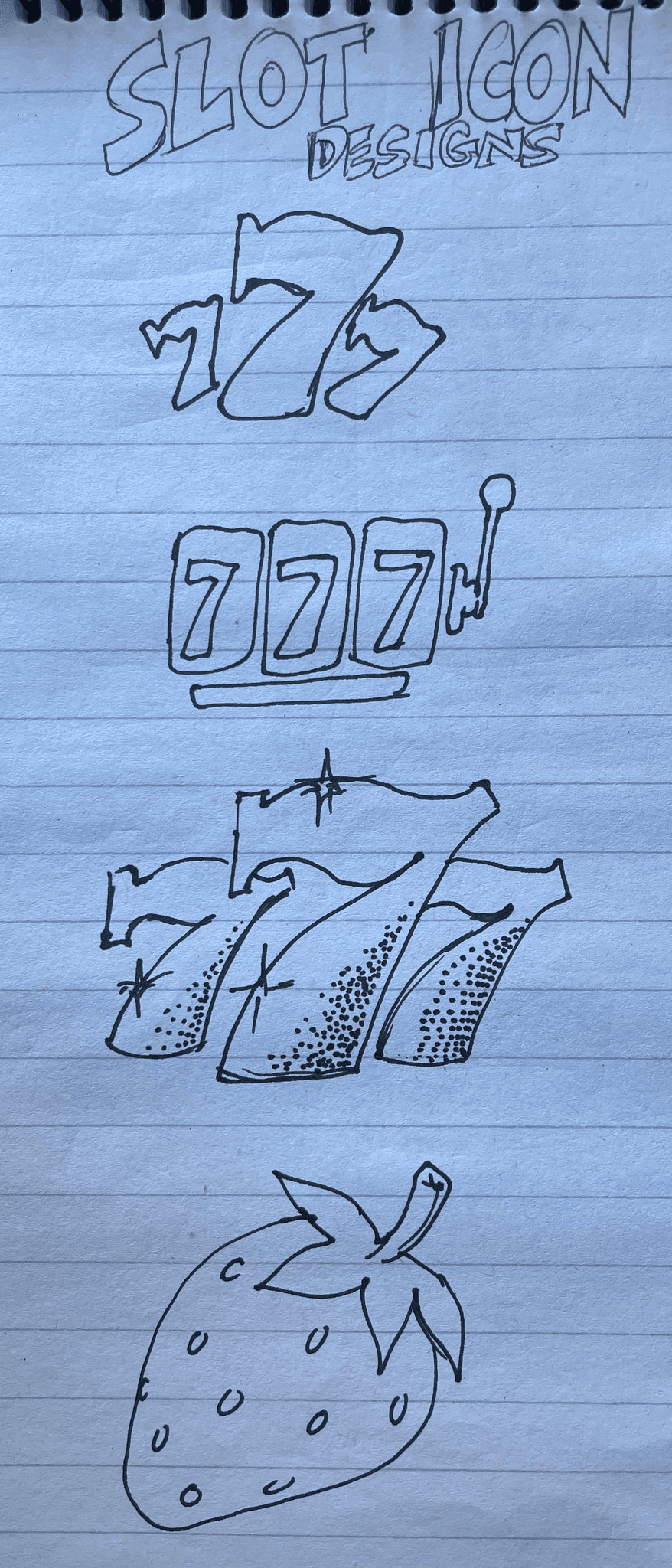
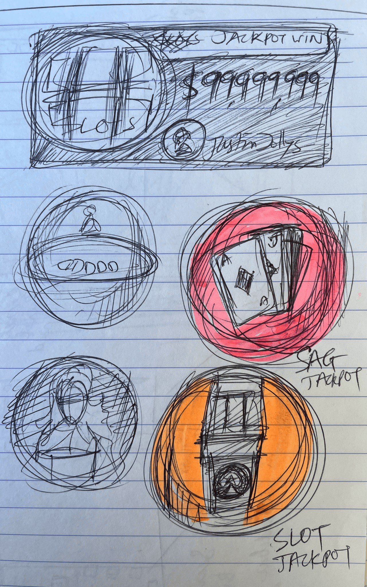
Lobby icons redesigned to be simple and close to other brand vertical icons
The consistent iconography was checked against other brand verticals of PokerStars and icons were revamped in the lobby landing page and across the whole app.
Redesigned lobby Learnings
To create a visually appealing Landing page for our Poker App was an iterative process that took almost 6 months for implementation. I learnt patience during the entire process. More close collaboration with the Product and Tech team to get things working in the App.